
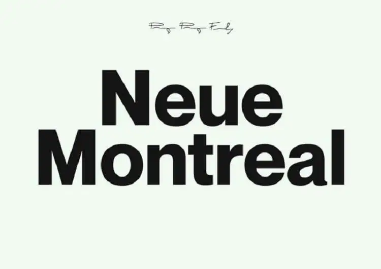

About Neue Montreal Font
I first tried the Neue Montreal Font while building a calm, modern layout for a digital magazine. I needed something clean, neutral, and flexible, but not cold. Many popular sans fonts felt too familiar, almost tired, so I went looking for a quieter, more contemporary voice.
Neue Montreal Font caught my eye because it sat nicely between strict modernism and friendly utility. It looked clear and honest, but with small details that felt human. I tested it across headings, body text, and simple UI elements for a long scrolling page. That first project led me to write about it here for Free Fonts Lab.
Font Style & Design Analysis
Neue Montreal Font is a sans-serif typeface with a strong, modernist backbone. The shapes feel rooted in classic Swiss-style typography, but they are not stiff. The strokes are even, the counters are open, and the overall silhouette stays quiet. In layouts, it steps back and lets the content lead.
The exact designer information is unclear, so I will treat it as designer unknown here. From a typographer’s eye, though, it feels like the work of someone who understands editorial and digital needs very well. The font family offers a useful range of weights, which helps when building hierarchy across different screen sizes.
The letterforms of Neue Montreal Font feel balanced and measured. The spacing is slightly generous, which helps readability in long text blocks and busy interfaces. Curves in letters like “a”, “c”, and “e” look soft but not playful, giving a calm, confident mood. The rhythm suits grids and clean layouts. It works best in simple, structured designs; if you need loud character or expressive display work, this sans-serif family might feel a bit too restrained.
Where Can You Use Neue Montreal Font?
I find Neue Montreal Font most at home in digital products and editorial work. It handles app interfaces, dashboards, and web platforms with ease. At larger sizes, like H1s and hero titles, it looks sharp and controlled without shouting. For branding systems that value clarity, it can serve as a steady core typeface.
In body text, Neue Montreal Font reads smoothly on screens thanks to its open forms and relaxed spacing. It stays legible at small sizes, especially when you pay attention to line height. I usually pair it with a serif typeface for long-form articles, using Neue Montreal for headings, UI labels, and captions. That contrast gives structure while keeping a unified visual identity.
For print, it works well on posters, brochures, and simple packaging where a modern sans-serif voice is needed. Corporate decks, portfolios, and case studies also benefit from its calm tone. When pairing, I often match it with a warmer serif or a subtle display font for titles, letting Neue Montreal Font handle the functional layers that must stay clear and honest.
Font License
The licensing terms for Neue Montreal Font can change depending on where you source it and how you plan to use it. Always check the official licence details for personal, commercial, app, or web use before including it in client work. I never rely on assumptions, especially for branding or large digital projects.
For me, Neue Montreal Font has become a quiet, dependable option when I need modern clarity without visual noise. It does not try to impress; it simply supports the design, which is often exactly what I want as a typographer and designer.


Leave a Reply