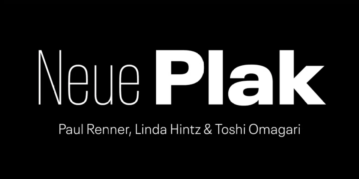
About Neue Plak Font
My first reaction to Neue Plak Font was simple: this is a clean, tough sans-serif with a strong voice. I liked how it felt direct without shouting. That balance made me curious, so I pulled it into a few layout tests for a branding concept.
What drew me in most was the mix of sharp control and a friendly tone. The shapes feel modern but not cold. I wanted to see if it could handle both bold headlines and clear body text in real work. For a review on Free Fonts Lab, I used it across posters, a landing page mock-up, and a basic social graphic set.
Font Style & Design Analysis
From my experience, Neue Plak Font sits firmly in the grotesque sans-serif family. It carries that classic European poster energy, with a solid, upright stance and very steady forms. The typeface feels built for impact, but there is enough softness in the curves to stop it from feeling harsh or mechanical.
As far as I could confirm, the exact designer is unknown in the sources I checked, so I treated it simply as a contemporary reinterpretation of mid-century grotesques. The intent seems clear: a versatile font family for branding, advertising, and bold editorial work, with a modern polish on an old-school idea.
Looking closely at the letterforms, the counters are fairly open, and strokes stay quite even. That gives a calm rhythm line to line, especially in medium weights. Spacing feels slightly tight by default, which helps headlines look compact and strong. In small sizes, though, you may want a bit more tracking. The mood leans confident and urban, but it is not playful, so it can feel too serious for very young or whimsical brands.
Where Can You Use Neue Plak Font?
In my tests, Neue Plak Font worked best in bold titles, poster layouts, and strong social media cards. At large sizes, its clean grotesque structure really shines. You can push the weight quite high and still keep good clarity. It suits brands that want a direct, modern, no-nonsense voice.
On screens, regular and medium weights handled UI labels and short paragraphs fairly well. For longer reading, I found it acceptable but not ideal; the tight spacing and firm geometry can feel a bit dense over many lines. I would keep it for short body text, captions, and section intros rather than full articles.
For pairings, I liked it with a light serif for editorial layouts, or with a softer humanist sans for more friendly brands. In logo work, it easily anchors a strong wordmark, especially in uppercase. It also feels right for music posters, tech products, and fashion lookbooks where a bold, structured visual identity is needed.
Font License
When it comes to licensing Neue Plak Font, always treat it with care. Different sources may offer different terms for personal and commercial use. Before you put it into client work or large campaigns, check the official licence details and make sure every use sits within those rules. My own takeaway: I reach for Neue Plak Font when I need a clear, confident grotesque that feels grounded and dependable, especially for bold branding and poster work.



Leave a Reply