

About New Century Schoolbook Font
I first reached for New Century Schoolbook Font while laying out a long textbook-style document for a client. I needed something calm, readable, and a bit traditional, but not too stiff or cold. My aim was simple: give students a clear reading experience without visual noise.
What drew me in was its quiet confidence. The shapes felt familiar, almost like old school books from the library, yet still clean enough for modern layouts. I decided to test it in several sections and write about my findings here for Free Fonts Lab, since it behaved differently than many classic book faces I use.
Font Style & Design Analysis
New Century Schoolbook Font is a serif font, and that classic serif structure defines its whole voice. The letterforms feel sturdy and rational, with a clear contrast between thick and thin strokes. It leans slightly formal, but not in a cold or academic way. Instead, it has a steady and reliable presence on the page.
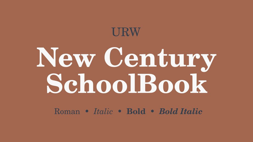
The typeface was designed by Matthew Carter for **Linotype**, and that heritage shows in how carefully it behaves in text. It comes from a time when print clarity was a serious problem to solve. You can see that old printing concern in the shapes: open counters, solid stems, and details tuned for rougher paper and ink spread.
The letterforms are wide and open, which gives the font family a relaxed rhythm. Spacing feels generous, so lines breathe well, especially in long paragraphs. The serifs are firm but not overly sharp, which softens the overall mood. This makes reading feel slower but less tiring. The strength is clarity in extended text; the main limitation is that it can feel a bit heavy or old-fashioned in very minimal, ultra-modern layouts.
Where Can You Use New Century Schoolbook Font?
I find New Century Schoolbook Font works best in long-form reading: textbooks, learning materials, policy documents, and manuals. Its serif structure gives a sense of order and trust, which suits education, government, and institutional work. When you set body copy at regular sizes, it stays comfortable and steady across many pages.
In small sizes, the open counters and clear strokes keep text legible, even in dense layouts. On screen, it can feel a bit chunky at very tiny sizes, but it still holds together better than many older book faces. In large headings, the weight and shape show more character, though it does not shout. It keeps a measured, almost reserved tone.
For pairings, I like using a clean sans-serif for headings or captions next to this serif body text. That contrast keeps layouts fresh while letting the serif do the reading work. It suits editorial grids, reports, education branding, and any project that needs reliability over style trends. It will not carry a flashy visual identity alone, but it supports serious content very well.
Font License
Licensing for New Century Schoolbook Font depends on the source and platform where you obtain it. Terms for personal and commercial use can differ, and usage on apps, web, or print may require separate rights. I always recommend checking the official licence details from the distributor before using it in client or commercial projects. For me, New Century Schoolbook is a dependable choice when I want calm, serious typography that quietly supports the content without pushing its own personality too hard.


Leave a Reply