

About Niagara Font
I came across Niagara Font while exploring serif options for a quiet, book-style poster. I needed something tall, calm, and slightly dramatic, but not loud or trendy. Many fonts felt too flashy, so I kept searching until this one caught my eye with its slim, upright stance.
I decided to test it more deeply for a set of title treatments I was preparing for a reading event. The narrow forms promised strong impact without taking up much space. That balance of elegance and economy made me curious enough to try it in real layouts and later review it for Free Fonts Lab.
Font Style & Design Analysis
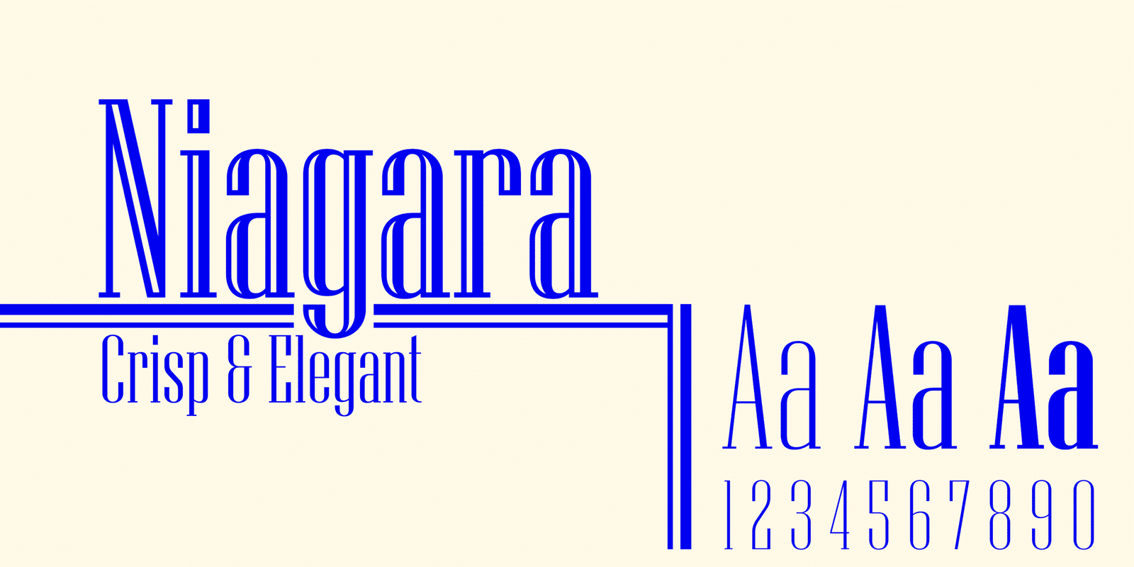
Niagara Font is a serif typeface with a very condensed silhouette and sharp, vertical energy. The letters stand tall and lean, almost like thin pillars on a page. The serifs are small and crisp, which keeps the shapes from feeling soft or playful. It looks serious, focused, and a bit old-fashioned in a tasteful way.
The designer is unknown, which is quite common for older or system-linked fonts that have travelled through many platforms. Because of this, I treat it more like a practical tool than a signature designer piece. There is no strong branding story here, just a familiar serif font family that many of us have bumped into over the years.
Looking closely at the letterforms, I notice tight curves, narrow bowls, and firm vertical strokes. The spacing is compact, so words feel dense and tall, especially in uppercase. This gives strong rhythm in short headlines but can feel squeezed in longer text lines. It works best when you let it breathe with extra tracking. Its strength lies in short titles, spine text, and vertical layouts; its main limitation is comfort and legibility at small sizes or long paragraphs.
Where Can You Use Niagara Font?
I find Niagara Font most useful for display roles where space is limited but you still want a serif voice. Book covers, film title cards, theatre posters, and narrow banners are good matches. Its condensed height helps you fit long words into tight spaces, such as pull quotes or slim sidebar headings.
At large sizes, the typeface shows its character well. The thin verticals and neat serifs create a serious, almost literary mood. For smaller sizes, however, the narrow shapes start to blur, especially on screens with lower resolution. I usually avoid it for body copy, captions, or long-form reading, because the tight width strains the eyes over time.
In pairings, I like using this serif with a clean sans-serif for body text, something neutral and open. The contrast between tall, condensed titles and comfortable reading text works nicely in magazine layouts and posters. It suits brands or projects that want a mature, slightly dramatic tone, such as arts events, bookshops, classic film projects, or heritage-focused campaigns.
Font License
The licence for Niagara Font can vary depending on where you obtain it. Some versions may allow personal use, while commercial use might need extra permission or a paid licence. I always advise checking the current licence details from the official source before using it in client work or large-scale projects. My own use stays cautious for that reason.
My personal takeaway as Ayan Farabi: I treat Niagara Font as a focused tool, ideal for tall, dramatic headlines, but I reach for something more open and relaxed when I need long, comfortable reading text.


Leave a Reply