

About Ninja Naruto Font
I first tried the Ninja Naruto Font while working on a fan-themed logo set for an anime event. The brief asked for something bold, sharp, and playful, but not childish. I needed a font that could hint at action, speed, and comics without looking messy or hard to read.
During my search for strong logo fonts for Free Fonts Lab, this one stood out right away. Its chunky strokes and cut edges felt energetic, almost like motion locked in place. I decided to test it in real layouts, with colour, texture, and shadows, to see if it could handle more than just one flashy wordmark.
Font Style & Design Analysis
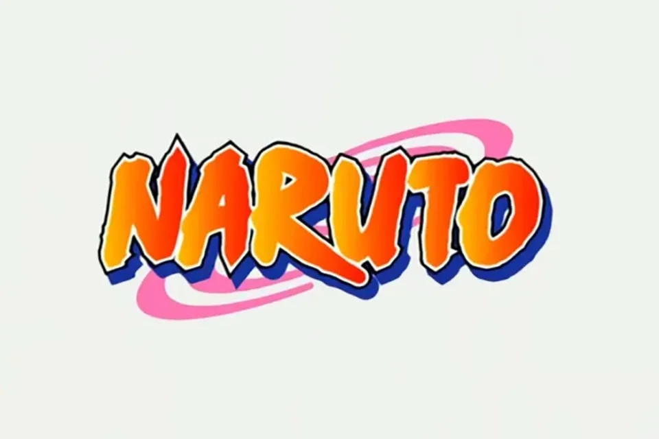
This typeface works best as a logo font, and that focus is clear in its design. The letters are wide, heavy, and angled, giving a sense of power and motion. Many strokes end with sharp cuts, which bring a comic and martial-arts feel. It looks like it belongs on posters, game titles, or bold branding for anime-inspired projects.
The creator of this font is designer unknown, at least from the sources I could verify. Because of that, I could not find an official design note or concept statement. So my view comes only from how it behaves in real layouts and mock-ups. I tested it mostly in vector design tools and simple grid-based logo systems.
The letterforms have thick strokes, small counters, and tight inner shapes. This gives the font a strong blocky look, but it can also close up at very small sizes. Spacing is quite tight by default, so I often add extra tracking for longer words. The rhythm feels punchy and loud, which is great for titles and emblems, but less ideal for calm or minimalist branding. As a logo font, its strength is impact, not subtlety, and you must use it in short text only.
Where Can You Use Ninja Naruto Font?
I see the Ninja Naruto Font working best in fan projects, gaming brands, or anime-themed events. It shines in large sizes, such as logos, badges, stream overlays, and YouTube thumbnails. When you push it big, the angled cuts and chunky forms really come to life, and the energy of the typeface feels intentional instead of noisy.
In smaller sizes, like body copy or UI labels, the font loses clarity and feels cramped. I would not use it for paragraphs or long taglines. Instead, I pair it with a clean sans-serif or simple geometric font family for supporting text. This balance lets the main wordmark carry the personality, while the rest of the typography stays calm and readable.
For layouts, I find it helpful to keep plenty of breathing room around the logo. The letterforms are dense, so white space, simple colour palettes, and flat backgrounds stop the design from feeling crowded. If your audience loves anime, comics, or action games, this logo font can speak their language quickly, as long as you keep the rest of the visual identity controlled and clear.
Font License
Before using the Ninja Naruto Font in client work or products, you should always check the current licence details at the original source. Some versions may allow personal use only, while commercial projects might need a paid or special licence. I never assume terms are open; I confirm them for every new project.
For me, this font is a fun, niche tool rather than an everyday choice. When a project needs loud, anime-style impact in a short logo or title, it does the job well, as long as I stay mindful of size, spacing, and licence limits.


Leave a Reply