
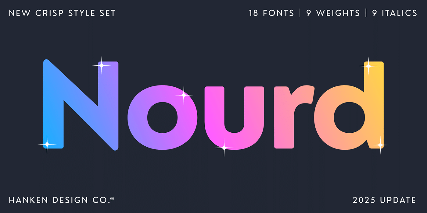

About Nourd Font
I first tried Nourd Font while working on a clean brand guide for a tech client. I needed a calm, modern voice that did not feel cold or harsh. This typeface caught my eye because it looked simple, but not boring. It felt practical, yet still had some personality in the curves.
I tested it in headings, UI labels, and small captions inside a prototype. The font stayed readable at many sizes, which made me look closer. For Free Fonts Lab, I decided to review it in detail, checking how it behaves in real layouts, not just in basic preview text.
Font Style & Design Analysis
This is a sans-serif font family with a very tidy, geometric feel. The shapes look built from circles and straight lines, but the corners are softened just enough. That balance gives it a gentle, friendly tone instead of a strict, technical one. It feels planned, but not stiff or mechanical.
The designer is unknown, so I approached it with some care and curiosity. When I test a font with no clear author credit, I look hard at spacing, accents, and basic consistency. Nourd Font holds together well in that sense. The character set seems focused, but it covers the usual needs for everyday design work.
The letterforms have open counters and steady vertical strokes, which helps legibility on screen. The spacing feels slightly tight at large sizes, so I often add a bit of tracking for headlines. At small sizes, the rhythm stays even, and the round shapes do not clog up. Its main strength is clean, neutral text; its limitation is emotional range, as it will not carry very expressive or artistic moods on its own as a sans-serif.
Where Can You Use Nourd Font?
Nourd Font works well in digital products, simple brand systems, and clean editorial layouts. For big headings on posters or landing pages, I like to add extra spacing so the forms can breathe. In those sizes, the geometric base becomes more obvious, which can support tech, startup, or education projects quite nicely.
In body text, it stays readable on screens, especially in short paragraphs or UI copy. I would use it for app menus, dashboards, and simple web articles where clarity matters more than charm. For long printed text, I might test it carefully, as the even strokes and regular rhythm can feel a bit plain over many pages.
It pairs well with a warm serif or a expressive script for contrast. I often combine it with a soft serif for titles and keep Nourd Font for navigation and captions. In layouts aimed at younger audiences or casual brands, you can lean on its soft curves, then add colour and imagery to supply the extra character it does not deliver alone.
Font License
The licence terms for Nourd Font can vary, so I always suggest checking the official source before using it. Make sure you confirm what is allowed for personal, commercial, web, and app use. When in doubt, treat it as a trial until you read the full licence text.
For me, this typeface is a quiet, reliable option when I need simple, modern typography that stays out of the way and lets the design speak.


Leave a Reply