
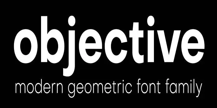

About Objective Font
I first reached for Objective Font while working on a clean brand guide for a tech start-up. I needed a neutral, honest voice that did not fight with the logo. The name caught my eye, but the shapes kept me testing it longer than expected.
What drew me in was how calm and even the typeface feels. Nothing screams for attention, yet the page looks clear and organised. I tried it across headlines, body text, and UI labels for a Free Fonts Lab mock-up. I wanted to see if this font family could handle a full visual identity without drama.
Font Style & Design Analysis
This is a sans-serif font, and it leans towards a modern, rational look. The design feels balanced, with low contrast strokes and very steady shapes. It reminds me of classic Swiss-style typography, but with a slightly softer presence. It stays out of the way and lets the content speak first.
Information on the creator is limited, so I have to treat it as designer unknown. That said, the decisions suggest someone who studies functional typography. The choices feel deliberate rather than random, which matters when you rely on a typeface for real client work.
The letterforms show open counters, simple terminals, and a moderate x-height, so reading feels easy on screens and print. Spacing is quite even, with no strange gaps between pairs. The rhythm across a paragraph stays smooth. As a sans-serif, it is strong for clarity, but it does not offer much personality for expressive or artistic work. If you need drama or strong character, this is not the right font style.
Where Can You Use Objective Font?
I see Objective Font working well in digital products, dashboards, and simple websites. At larger sizes, like H1 and H2 headings, it looks steady and confident, but never loud. At small sizes, labels and navigation stay readable, which helps when building clean, minimal UI layouts.
For print, it suits manuals, reports, and brand guidelines where clarity matters more than flair. It can also support simple packaging, especially for tech, health, or home products. I would pair this typeface with a warmer serif or a gentle script for contrast. That mix keeps the system from feeling too cold.
When I tested Objective Font in long-form text, it stayed readable but felt a bit plain for editorial spreads. It shines more in structured layouts, grids, and clear hierarchy. Use it for body text in corporate work, pitch decks, and presentation slides. For young or playful audiences, I would bring in a second display face to add energy.
Font License
The licence for Objective Font can change depending on the source you use. Some versions might allow personal projects only, while others may cover commercial work. I always recommend checking the official licence details carefully before using it in client jobs or large branding systems.
After testing it across several layouts, my honest take is simple: Objective Font is a quiet, reliable tool. I reach for it when I need order, not personality.


Leave a Reply