

About Objectivity Font
I came to the Objectivity Font while comparing clean typefaces for a tech dashboard project. I needed something neutral, but not boring. Many options felt either too cold or too quirky. This one sat in a comfortable middle space that looked stable, honest, and very usable for long-term work.
What pulled me in was its calm, structured voice. The shapes felt familiar, but not copied from the usual modern classics. I decided to test it more deeply for interface labels, charts, and some branding mockups for Free Fonts Lab. I wanted to see how far I could push this font family in real design tasks.
Font Style & Design Analysis
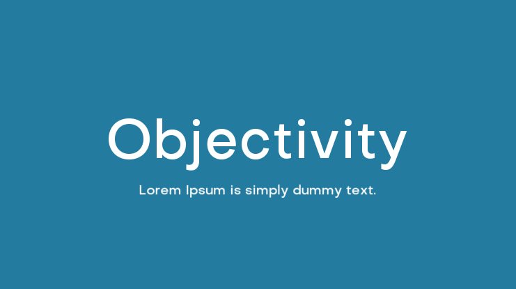
The Objectivity Font is a sans-serif typeface with a very rational, measured look. The design direction leans towards geometric structure, but with enough optical tweaks to keep it readable. Strokes feel even and controlled. The overall typography impression is clean, almost clinical, yet still human enough for everyday communication.
From what I have seen and tested, the font family clearly comes from a professional foundry, though exact designer information is not always highlighted in common sources, so I treat it as designer unknown. The build quality, glyph coverage, and spacing all suggest a serious commercial-level project rather than a quick experimental release.
The letterforms show a careful balance between circles and straight lines. Counters are open, which helps at smaller sizes. Spacing feels slightly tight by default, giving a compact rhythm that suits interfaces and headings. The mood is objective, quiet, and low-ego. It does not shout. A limitation appears when you need strong personality or warmth; this sans-serif tends to fade into the background, which can be either a strength or a weakness depending on the visual identity.
Where Can You Use Objectivity Font?
I find the Objectivity Font most useful in product design, dashboards, and corporate communication where clarity matters. In large sizes, such as headlines, it looks sharp and disciplined, especially in bold weights. It works well for tech brands, finance apps, and clean editorial layouts that need a rational tone.
At smaller sizes, the open letterforms and structured spacing help a lot. Interface labels, tables, charts, and form fields stay readable on both desktop and mobile. For body text, it works, but I usually give it a bit more line spacing. It suits users who value function over decoration and like a serious, stable visual identity.
For pairings, I often combine this typeface with a softer serif or a friendly humanist sans-serif for contrast. In layouts, it takes grid systems very well and stays aligned without visual noise. If you need a neutral base font family that lets colour, imagery, and layout carry the emotion, this typography choice will feel dependable.
Font License
Licensing for the Objectivity Font can vary by source and version, especially between personal and commercial use. I always treat it as a licensed asset and check the official provider for current terms. Before using it in client projects, confirm desktop, web, and app rights to stay safe.
After using it across a few real projects, I see this font as a reliable workhorse: not dramatic, but quietly effective when I need calm, clear typography.


Leave a Reply