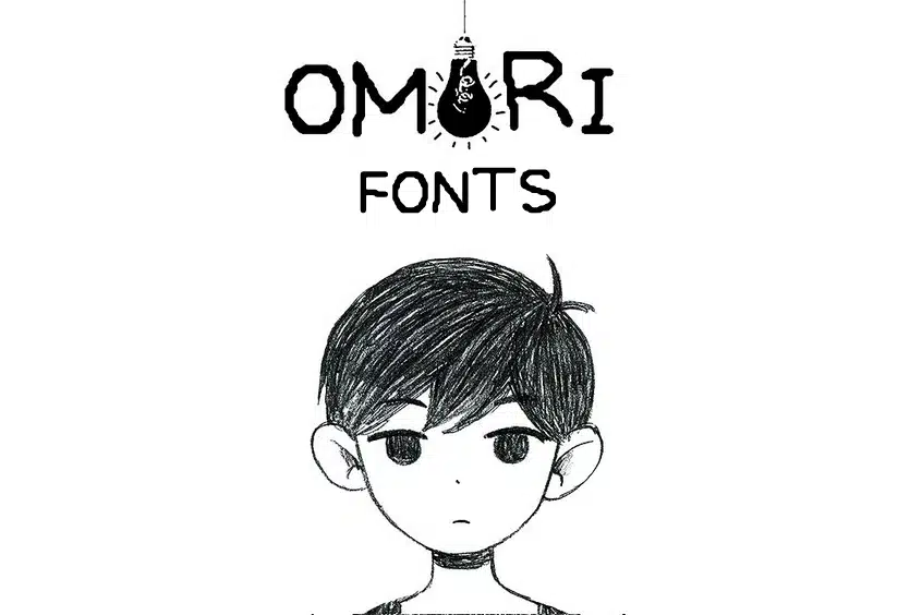
About Omori Font
I first tried Omori Font while working on a moody game logo for a personal concept project. I needed a logo font that felt hand-drawn, a bit fragile, and slightly eerie, without drifting into full horror. The name kept coming up in conversations, so I decided to test it properly.
What pulled me in was its raw, sketch-like energy. The strokes look imperfect on purpose, which gives the typeface a strong voice. I used it in mock posters, cover art, and a simple title card to see how far it could stretch. For Free Fonts Lab, I wanted to understand if this font is just a trend piece or a tool we can trust in real design work.
Font Style & Design Analysis
Omori Font sits firmly in the logo category, built for titles and strong visual identity marks. The font style feels like pencil or ink drawn on paper, then lifted straight into digital form. Lines are uneven, edges are rough, and the texture adds a nervous, emotional tone. It is not a calm, neutral typeface; it carries mood in every letter.
The exact creator of this font is often shared simply as “designer unknown”, which makes sense given how it spread through fan communities. From my perspective, it feels like a labour of love linked to the original game’s visual language. Because the source is not crystal clear, I treat it as a stylised tribute typeface rather than a mainstream commercial release.
The letterforms are narrow and tall, with shaky strokes that lean slightly and break rhythm on purpose. Spacing is tight, and some pairs can feel cramped, so I often adjust tracking when building a logo or wordmark. The mood sits between vulnerable and unsettling, which works well for titles, but not for body text. Its strength lies in emotional impact; its weakness is readability at very small sizes.
Where Can You Use Omori Font?
I see Omori Font as a focused logo tool, best used for game titles, album covers, and experimental posters. It performs strongly in large sizes, where the scratchy texture and imperfect strokes become part of the story. On dark backgrounds, the contrast feels especially tense and expressive, which suits dramatic layouts.
At medium sizes, such as chapter titles or section headers, it still works if you give it breathing room and adjust spacing. I avoid using it in long sentences or body copy because the jittery rhythm tires the eye. For pairing, I usually support it with a calm sans-serif or a simple serif font family, so the logo can carry the emotion while the rest stays readable.
This typeface speaks well to audiences who enjoy indie games, lo-fi art, and hand-drawn aesthetics. It fits mental health themes, surreal stories, and introspective projects where fragility is part of the message. If you push it into cheerful branding or corporate work, the tone feels off. Used with intention, though, it can define a visual identity with just one word.
Font License
Licensing around Omori Font is not always clearly documented, especially as it spreads through fan communities. I never assume it is free for commercial work. Before using it in any paid or public project, I strongly recommend checking the original source and reading the licence terms carefully.
For me, this font works best as a specialised tool: powerful for the right story, but never a one-size-fits-all choice.


Leave a Reply