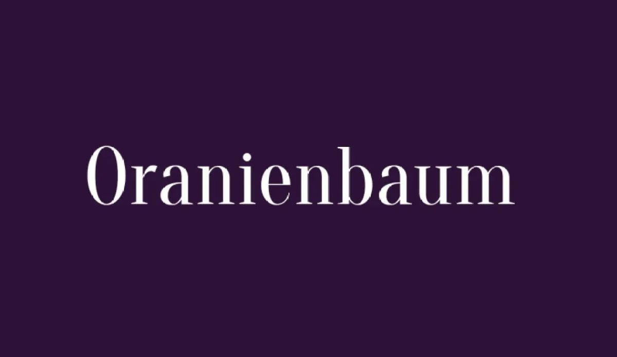
About Oranienbaum Font
I first tried the Oranienbaum Font while working on a small book cover for a local history project. I wanted something calm, classic, and slightly grand, but not too stiff or old-fashioned. When I typed the title, the tall shapes and sharp details caught my eye straight away.
What drew me in was its strong sense of structure. The caps felt confident, but the curves still had some grace. I decided to test it more deeply and later wrote about my experience for Free Fonts Lab, because this typeface behaved better in real layouts than I expected.
Font Style & Design Analysis
The Oranienbaum Font is a serif typeface with a clear, upright posture and a strong classical feel. The contrast between thick and thin strokes is noticeable, but not too extreme, so it keeps a readable texture. It feels rooted in traditional book typography, yet the proportions give it a modern, slightly condensed look.
From what I could find, the designer information is not always presented clearly, so I treat it as designer unknown when I document projects. That said, the font family shows a careful hand. The details in the serifs and terminals suggest someone with a solid understanding of classic type design.
The letterforms are tall with relatively narrow widths, which helps fit longer titles into tight spaces. The spacing feels balanced, with a steady rhythm that works nicely in centred layouts. Uppercase letters feel stately, while lowercase keeps text grounded. It shines in headlines, pull quotes, and short paragraphs, but long-body text can start to feel a bit formal and rigid for relaxed reading.
Where Can You Use Oranienbaum Font?
In my own work, I find the Oranienbaum Font very effective for book covers, chapter titles, and editorial layouts. At large sizes, the serifs and stroke contrast look elegant and crisp. It works well for museums, cultural events, and academic publications that want a serious but still approachable visual identity.
At medium sizes, such as subheadings, menus, and gallery labels, the serif structure keeps the typography clear and confident. I would use it for certificates, wedding stationery with a formal tone, and brand marks for law firms or universities. It speaks to audiences who value tradition, trust, and stability.
For smaller body text, I use it with care. It stays readable, but the compact shapes can feel slightly dense in long blocks. I often pair this serif with a clean sans-serif for body copy, letting Oranienbaum handle titles and key phrases. Simple layouts, generous line spacing, and clear margins help the font breathe and show its best character.
Font License
Licensing for the Oranienbaum Font can vary depending on where you get it. I always check the official source before using it in client work or commercial projects. For personal experiments or mock-ups, I still read the licence terms carefully, just to be sure I stay on the safe side.
My honest take as Ayan Farabi: I reach for Oranienbaum when I need a reliable, dignified serif that gives structure and calm authority without shouting for attention.


Leave a Reply