

About Painter Font
I first tried Painter Font while working on a poster for a small local art fair. The client wanted something loose, brushy, and bold but still readable from a distance. I needed a script that felt handmade without turning the text into a messy splash of strokes.
Painter Font caught my eye because its strokes look like real paint pulled across paper. It felt energetic but not wild. I tested it in a few headline layouts for that project and then explored it further for Free Fonts Lab, checking how it behaved in different sizes, colours, and backgrounds.
Font Style & Design Analysis
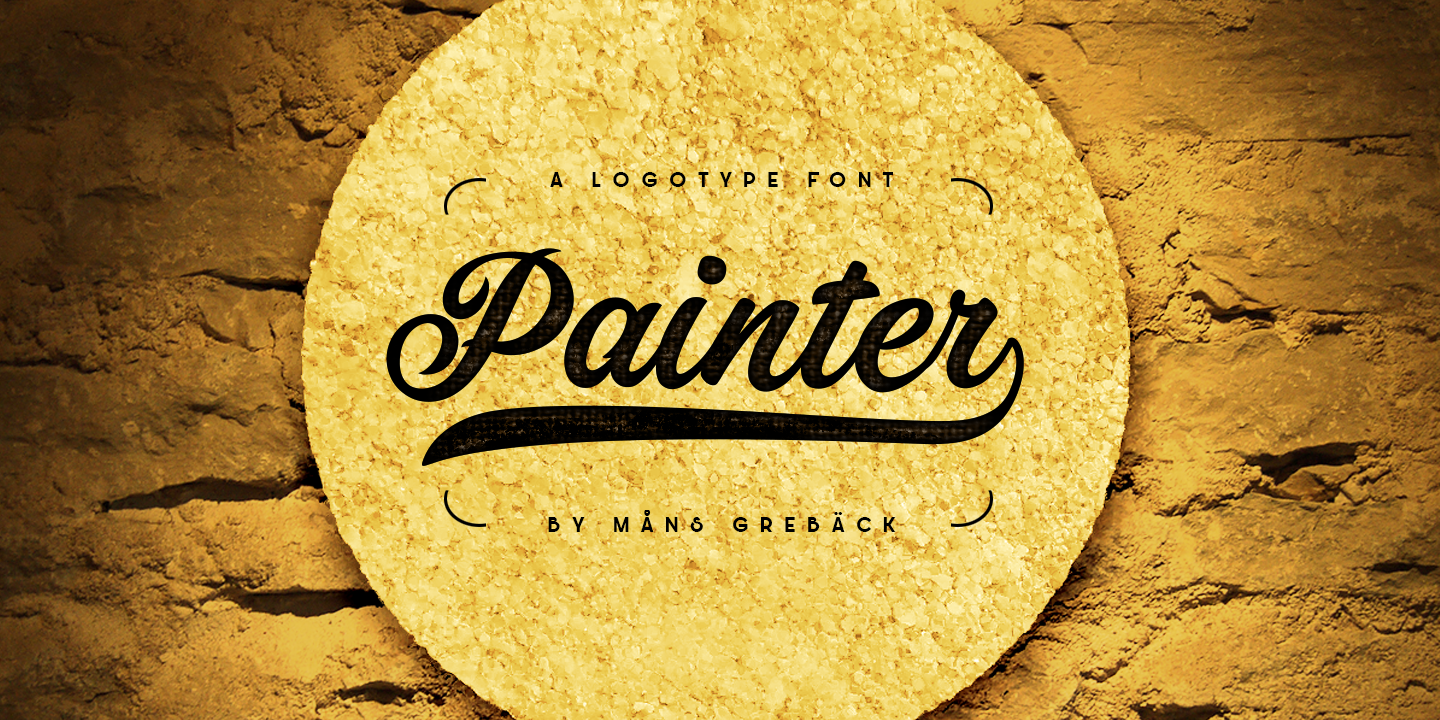
Painter Font is a script typeface with a strong brush-painted look. The strokes feel like they come from a flat brush, dragged with firm pressure. Letters lean slightly forward, which adds movement and a sense of action. It has that street-art energy but stays more controlled than many brush scripts.
The designer unknown note makes it harder to track intent, but the visual choices are clear. This font family aims for bold display work, not quiet body text. The heavy strokes and clear contrast between thick and thin parts suggest it was built for posters, packaging, and social graphics.
The letterforms are wide and open, with rounded corners that soften the aggressive brush texture. Spacing is fairly tight, but not so tight that letters crash into each other. The rhythm feels bouncy, especially in words with a lot of curves. This script font shines in short phrases and logos but can feel tiring in long lines. It works best when you keep words brief and give them breathing space.
Where Can You Use Painter Font?
I see Painter Font working well in projects that need a bold, creative voice. Think event posters, music covers, streetwear branding, or café boards. At large sizes, the paint-like texture and strong strokes really stand out. Headlines, logos, and hero text are where the typeface feels most at home.
At smaller sizes, some of the brush detail gets lost, and the heavy strokes can crowd together. I would avoid it for long paragraphs, menus, or captions. Instead, I pair it with a clean sans-serif or simple serif for body text. This contrast keeps the layout readable while letting Painter Font handle the expressive parts.
Painter Font also fits youth-focused or creative audiences: art studios, craft brands, street-style labels, or social media campaigns. When I use it, I keep lines short, increase line spacing, and centre or left-align headlines for balance. It can work nicely on packaging too, especially for handmade or bold-flavoured products.
Font License
Before using Painter Font in any project, I always check the current licence on the original source. Permissions for personal and commercial use can change over time. Never assume it is free for client work. Read the licence details carefully and make sure your use fits the allowed terms.
For me, Painter Font is a strong choice when I need loud, brushy energy without losing all control. Used with care and paired with calmer type, it can give a design clear personality and a confident, painted voice.


Leave a Reply