
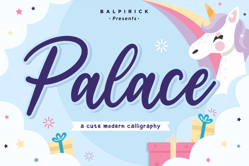

About Palace Font
I came across Palace Font while searching for a calm, elegant script for a wedding invite set. Many calligraphy options felt either too messy or too formal, but this one sat somewhere comfortable in between. That balance made me curious enough to test it in a real layout.
I first tried it on a soft cream background with muted gold accents. The curves held up well, even with delicate colours. I later used it in a styled mockup for Free Fonts Lab, just to see how it behaved in different sizes and formats. That small test run told me a lot about its real strength as a working typeface.
Font Style & Design Analysis
Palace Font is a calligraphy typeface with smooth, flowing strokes and a gentle, decorative presence. The letters feel written by hand with a steady, confident pen. It leans towards a romantic mood, but it does not scream for attention. Instead, it brings a soft, graceful tone to the page.
The designer is listed as designer unknown, which means I could not track a clear author or foundry background. That can make context a bit tricky, but it does not change how the font behaves in real projects. I still judged it as I would any other calligraphy font family: by rhythm, balance, and clarity in use.
The letterforms have tall loops, gentle swashes, and a light sense of movement from left to right. Spacing is fairly tight, which helps build a connected flow, but it can crowd in long words. The rhythm works nicely for short names, headings, and short phrases. For dense text, the ornate calligraphy style becomes hard to read, so I would avoid using it as body copy.
Where Can You Use Palace Font?
In my testing, Palace Font worked best for wedding stationery, event titles, and soft branding pieces. At large sizes, the calligraphy curves show clear detail without feeling overly fancy. It is well suited for save-the-date cards, menu headings, and delicate posters where you need a romantic voice.
At medium sizes, such as social media headers or packaging labels, it still reads clearly when you keep the words short. I like pairing this font style with a clean sans-serif or quiet serif for body text. That contrast helps keep the visual identity balanced, so the script can sing while the support text stays readable.
At small sizes, the fine strokes begin to blend, especially on screens. I would avoid using it for captions, disclaimers, or long quotes. Instead, I use it for first names, short taglines, or single standout words. In brand systems, it makes sense as an accent typeface, not the main workhorse of the typography.
Font License
The licence for Palace Font can vary depending on where you download it. Some sources allow personal use only, while others may permit commercial work. I always recommend checking the latest licence details from the original provider before using it in client projects or paid designs.
For me, Palace Font is a gentle, decorative choice that works best in small, focused doses. When I respect its limits and pair it with simpler fonts, it adds a quiet elegance without getting in the way of clear communication.


Leave a Reply