

About Paris Metro Font
I first tried the Paris Metro Font while working on a poster for a small film event. I needed a bold title that felt urban, loud, and a bit nostalgic, without looking messy or cheap. This font caught my eye because it promised strong character with simple, readable forms.
I tested it across a few layouts for that project and later wrote notes for Free Fonts Lab. The font felt confident, almost like vintage transport signage mixed with modern display polish. I wanted to see if it could handle both loud headlines and quieter subheads without losing its charm.
Font Style & Design Analysis
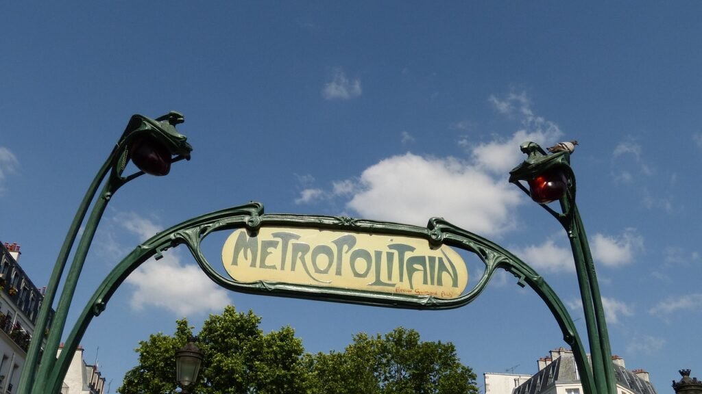
This is a display typeface with a clear focus on striking, compact titles. The letters feel structured and geometric, but they still keep a friendly warmth. It looks inspired by classic city signage, with a transport or metro vibe that gives it a strong sense of place and story.
The exact creator of this font is listed as designer unknown, which limits how much backstory I can trace. Even so, the design choices feel deliberate. The font family shows a clear vision: punchy shapes, solid weight, and consistent styling that suggests someone with experience built it for headline work.
The letterforms are fairly wide, with strong vertical strokes and firm horizontal endings. Spacing is tight but not cramped, which helps words lock together like tiles. This rhythm works well for short phrases and logos, but long text blocks become heavy quickly. The font style shines in bold centre layouts, but it is less flexible for detailed copy or dense information.
Where Can You Use Paris Metro Font?
I see the Paris Metro Font working best in posters, event graphics, and bold social media visuals. At large sizes, the display shapes feel powerful and confident. The geometry reads clearly from a distance, which suits signage, title cards, and hero headlines for music, film, or cultural projects.
At medium sizes, it can handle short taglines, navigation labels, or section headers if you give it enough breathing room. For long paragraphs or body text, it quickly feels too heavy and blocky. I usually pair it with a clean sans-serif for the main copy, so the display personality stays focused on titles and key phrases.
For audience fit, it works well for younger, urban, or creative brands that want a strong visual identity without going full grunge. It also suits transport, travel, and city-themed layouts. Since it is a display font, I treat it as the lead voice in a layout, then balance it with lighter, more neutral supporting typefaces.
Font License
The Paris Metro Font may have different licence terms depending on where you obtain it. Always check the official source for details on personal and commercial use. I strongly recommend reading the licence carefully before using it in client projects or paid work.
For me, this font works best as a strong, occasional headline voice rather than a daily workhorse. Used with care, it can give a layout a clear sense of place and attitude without overpowering everything else.


Leave a Reply