

About Patagonia Font
I came across Patagonia Font while searching for a bold headline style for an outdoor-themed poster. The client wanted something strong, simple, and easy to read from far away. I needed a font that felt confident, but not too aggressive or flashy.
What pulled me in was its clean shape and clear structure. It looked like it could carry short words with impact. I decided to test it in a few mockups for Free Fonts Lab, mainly for titles, logo sketches, and social graphics. I wanted to see how this font behaved in real layouts, not just in a preview box.
Font Style & Design Analysis
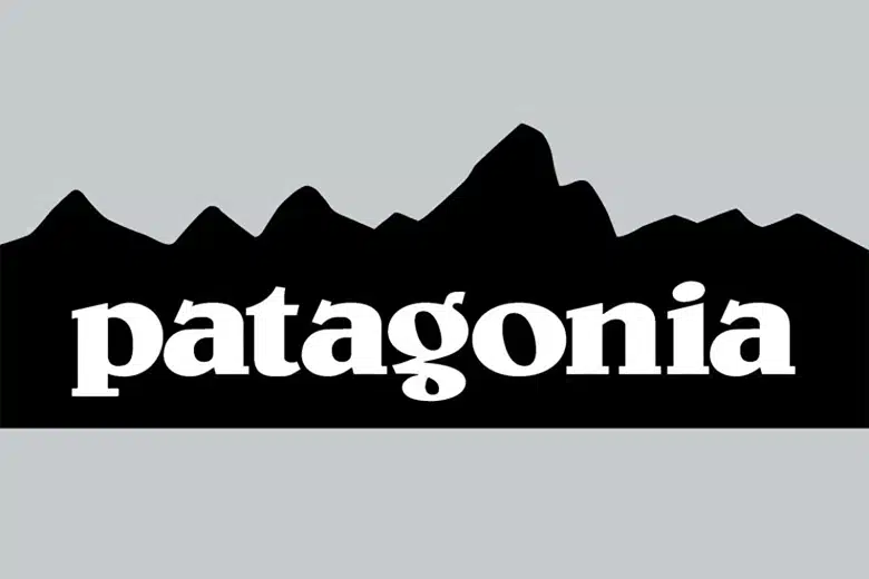
Patagonia Font is a display font, and it clearly aims to work at large sizes. The font style feels sturdy, with simple, blocky letterforms and a strong presence on the page. It gives a sense of stability and directness, which suits bold branding, posters, and packaging.
The designer is unknown, so I approached it without expectations or bias. I just judged it based on how it behaved inside my layouts. As a typeface, it sits in that space where you can imagine it on a logo, a sign, or even a T-shirt graphic. It does not try to be clever; it just stands firm.
The letterforms are quite geometric, with even strokes and minimal detail. Spacing is fairly tight, which works well for short words, but longer text can start to feel cramped. The rhythm of the font family suits punchy headlines more than paragraphs. It brings a bold mood, but it lacks subtlety, so it is not ideal for delicate or editorial typography.
Where Can You Use Patagonia Font?
In my tests, Patagonia Font worked best in big, clear titles. Think posters, banners, hero images, and logo explorations. At large sizes, the display shapes feel solid and easy to read. It holds its weight well against strong colours and busy backgrounds, which is helpful for social media graphics.
At small sizes, it starts to lose some clarity, especially if the line spacing is tight. I would avoid using it for body text, captions, or long paragraphs. It is better as a top-line element in your visual identity, supported by a clean sans-serif or serif font family for the rest of the typography.
For pairings, I found it works nicely with a neutral sans-serif for body copy. This keeps the layout balanced and stops the page from feeling heavy. If you are designing for outdoor brands, sports events, or youth-focused posters, Patagonia Font can act as the bold voice while a calmer companion font handles the details.
Font License
The licensing for Patagonia Font can change depending on where you download it. Always check the official source for clear terms before using it in client work. Make sure you confirm permission for commercial projects, logo use, and large print runs, not just personal or test designs.
For me, Patagonia Font is a useful display option when I need a strong, uncomplicated headline. I reach for it when clarity and bold impact matter more than subtle personality.


Leave a Reply