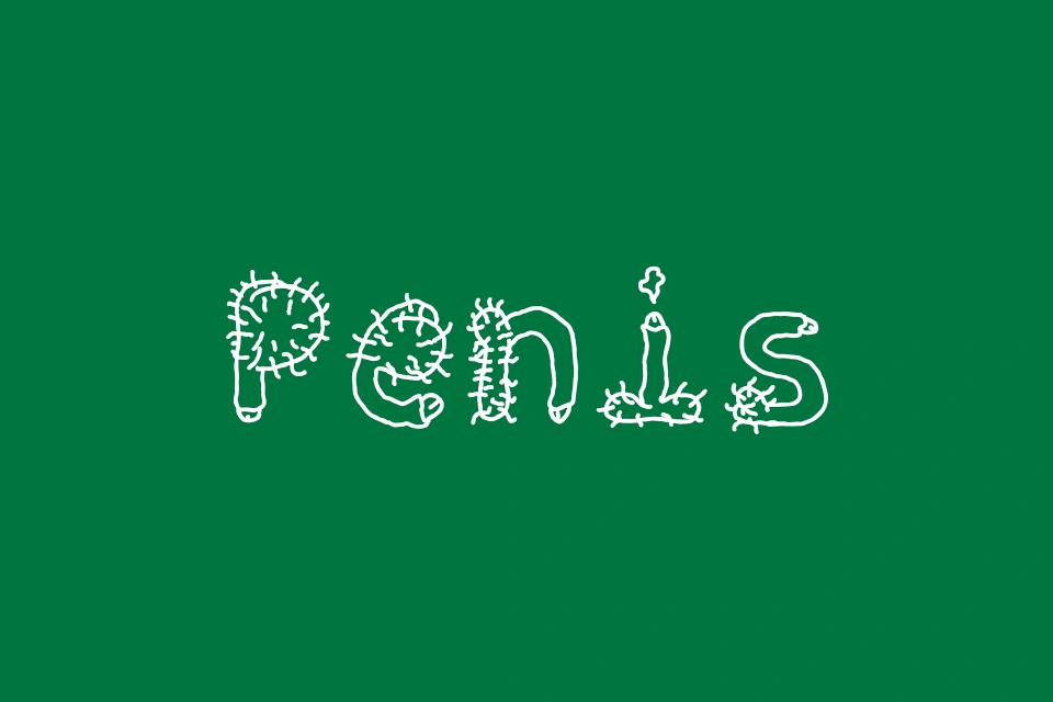
About Penis Font
I came across Penis Font while testing different options for a bold, cheeky poster project. The brief needed something simple, clear, and a bit daring, but not messy or hard to read. I was looking for a typeface that stayed clean while still starting a conversation.
That mix of direct shapes and awkward humour made me stop and try it out. I wanted to see if the font style could work beyond a joke, especially in layouts where typography carries most of the message. For Free Fonts Lab, I also wanted to judge it like any other font family, not just a novelty.
Font Style & Design Analysis
This is a sans-serif font, and that is clear the moment you set a full line of text. The strokes feel simple and stripped back, with no extra curls or decoration. That plain structure gives the typeface a very direct voice, which can either calm the joke down or make it hit harder, depending on how you use it.
The designer is unknown, and that affects how I think about long-term use. When I cannot trace a clear foundry or author, I stay careful with large brand work. It feels more suitable for short-term or one-off pieces than for a core visual identity, because support and updates are unlikely.
Looking closely at the letterforms, the shapes are even, with moderate spacing that keeps words readable at mid sizes. The rhythm is steady, so blocks of text do not wobble or feel unbalanced. Still, it is not a refined text workhorse. It handles titles, labels, and short copy, but long reading feels flat. The mood sits between neutral and playful, and the sans-serif construction keeps the tone clear, even when the name suggests something louder.
Where Can You Use Penis Font?
I see this font working best in casual, adult, or edgy projects where the message is not too serious. Think party posters, club flyers, humorous social media graphics, or student event layouts. At large sizes, the clean shapes hold up nicely, and the typeface stays sharp and readable on screens and in print.
At smaller sizes, the font is still legible, but the character that makes it special starts to fade. I would avoid using it for body text or long captions. Instead, I would use it as a headline voice, then pair it with a calmer sans-serif or serif for supporting copy. That mix keeps the design controlled and easy on the eye.
For audiences, it suits open, informal groups who are not afraid of bold humour. It does not fit formal brands, corporate decks, or anything for children. In layout, I would give the letters space to breathe, use strong colour contrast, and keep other graphic elements simple, so the Penis Font name and look do not overpower the whole design.
Font License
The licence for Penis Font can change depending on where you download it, so I do not assume it is free for every use. I always check the official source to confirm if personal, commercial, or client projects are allowed, and I keep a copy of the licence terms for my records.
As a designer, I see Penis Font as a very situational tool: useful when the concept truly calls for it, and best handled with care and intent.


Leave a Reply