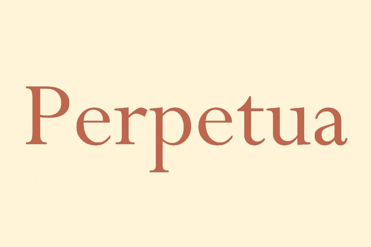
About Perpetua Font
I first reached for Perpetua Font while working on a calm, text-heavy booklet for a museum client. They wanted something classical, but not dusty or stiff. I needed a typeface that felt bookish, readable, and cultured, without shouting for attention on every page.
That search led me back to this quiet, confident serif. I had seen it many times in books and academic work, but never really pushed it in my own layouts. For Free Fonts Lab, I decided to test it in long paragraphs, pull quotes, captions, and even simple covers. The more I used it, the more its subtle character made sense.
Font Style & Design Analysis
Perpetua Font is a classic serif typeface with a very literary voice. The shapes feel crisp and carefully drawn, but not cold. Strokes are fine and sharp, with delicate contrast between thick and thin parts. It has that old-style, book page feeling, yet the overall texture stays light and airy on the screen.
The design is credited to Eric Gill, which matches what I know from traditional type history. You can see his hand in the balance of structure and warmth. The letterforms show a mix of calligraphic influence and rational construction, which keeps the font family standing somewhere between human and formal. There is a quiet sense of craft in each detail.
Looking closely at the letterforms, the serifs are fine and slightly tapered, which gives text a gentle rhythm. The lowercase has a narrow feel, so lines can fit more words without feeling cramped. Spacing is on the tighter side, yet still readable in print. On screen, especially at small sizes, the thin strokes can look fragile. That is the main limitation I noticed. Used at medium or larger sizes, the serif structure really shines and gives text a graceful, thoughtful mood.
Where Can You Use Perpetua Font?
I find Perpetua Font works best in projects that need trust and calm authority. Think essays, books, small magazines, and refined brochures. It suits educational material, cultural reports, and literary covers. In headings set a bit larger, the serif details bring a quiet drama that feels serious but not rigid.
For long reading, it performs well in print when the size is not too small. Around 10–12 pt in books or reports feels comfortable. On screens, I prefer it for headings, pull quotes, and short sections of body text, rather than dense paragraphs. At very small sizes, the fine strokes start to fade, which can hurt readability.
In terms of pairing, I usually match this serif with a clean sans-serif for contrast. A neutral sans works well for captions, data, and UI elements, while Perpetua Font handles body copy or titles. It also behaves nicely in centred layouts, poetry pages, and simple typographic covers where you rely on spacing, alignment, and hierarchy more than heavy decoration.
Font License
The licence for Perpetua Font can vary by source and format, especially between desktop and web use. I always recommend checking the current licence details from the official or distributing source before using it in client work or commercial projects. For personal experiments, I still read the terms first to avoid surprises.
In my own practice, I reach for Perpetua when I want text to feel thoughtful, restrained, and bookish, without drifting into nostalgia. Used with care and the right sizes, it rewards patience and gives layouts a steady, grown-up voice.


Leave a Reply