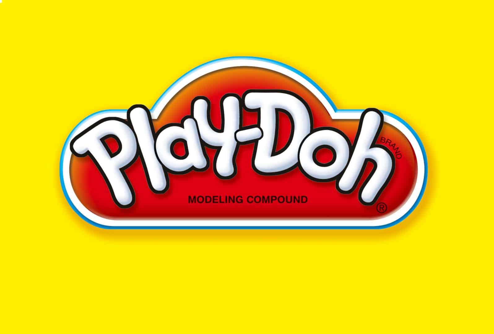
About Play Doh Font
I came across the Play Doh Font while testing options for a playful kids’ craft workshop poster. I needed something that felt friendly, bold, and a bit messy, but still readable for parents and teachers. Many cute fonts looked either too clean or too wild, so this one caught my eye right away.
What drew me in was the soft, chunky look of the letters. They felt like letters shaped by hand, not by a strict grid. I decided to try it in a real layout for the event title, then later explored it deeper so I could share my thoughts on Free Fonts Lab for other designers facing similar projects.
Font Style & Design Analysis
This typeface sits clearly in the handwritten category, with a look that mimics soft moulded shapes. The letterforms feel as if someone pressed them out of clay or dough. Strokes are rounded and full, with almost no sharp edges. The font style gives off a relaxed, playful energy that suits light-hearted themes.
The designer of Play Doh Font is designer unknown, which often happens with fan-made or inspired fonts. From my testing, it looks like someone studied toy packaging and children’s branding, then translated that feel into a casual handmade font family. The construction is simple on purpose, which helps it stay approachable.
The letterforms are wide, with generous spacing that keeps words open and airy. This rhythm works well for short titles, but long text lines start to look a bit loose. Some curves feel slightly uneven, adding to the handmade mood but also reducing polish. Its strength lies in big, cheerful headlines. For tight, formal typography, it will not be the right choice.
Where Can You Use Play Doh Font?
In my projects, Play Doh Font worked best for children-facing design. Think toy labels, birthday invitations, kids’ workshop posters, or playful classroom materials. At large sizes, its handwritten style looks warm and fun, with enough weight to stand out even on busy, colourful backgrounds.
At medium sizes, like subheadings or short quotes, it still reads fine, as long as the line length stays short. I would avoid using it for body text, especially in print, because the open spacing and chunky shapes slow reading. For digital layouts, it works nicely as a hero title paired with a clean sans-serif for the smaller copy.
Audience-wise, it speaks clearly to children, parents, and playful brands rather than corporate clients. I like pairing Play Doh Font with a simple geometric sans for balance, keeping the playful tone in the headlines only. Used with plenty of white space, it can create a fun, soft visual identity without feeling chaotic. Among handwritten choices, it fills a sweet, childlike niche.
Font License
The licensing terms for Play Doh Font can vary depending on where you download it. Do not assume it is free for commercial branding or client work. Always read the licence details on the official source and, when in doubt, contact the creator or rights holder before using it in paid projects. For me, that extra check is worth the time.
My honest take as Ayan Farabi: this font is a charming tool for child-centred, playful design, but it works best when used sparingly and with a clear supporting typeface.


Leave a Reply