

About Playlist Font
I first tested Playlist Font while working on a relaxed branding mock-up for a lifestyle shop. I wanted a handwritten feel that looked casual but still readable. Many script fonts felt either too messy or too formal, so this one sat in an interesting middle space for me.
What drew me in was its loose, brush-like flow and friendly energy. It looked handmade without pretending to be a real signature. I tried it in logo sketches, packaging labels, and some quick social graphics for a test project on Free Fonts Lab. That gave me a good sense of how it behaves in different layouts.
Font Style & Design Analysis
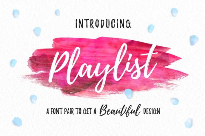
Playlist Font is a script font, and it leans strongly into a casual brush style. Strokes feel quick and relaxed, as if written with a slightly dry marker. The letters connect in a loose way, not too stiff, which gives the typeface an easy, friendly voice. It feels more playful than elegant.
The official designer information for this font is not clearly documented, so I have to treat it as designer unknown. That lack of clear authorship always makes me a bit careful, especially for client work. When I do not know the foundry or creator, I pay extra attention to technical quality and licensing notes before I commit to a project.
The letterforms have tall loops, open counters, and a gentle slant that adds movement. Spacing is fairly tight, which can look good in short words, but long phrases start to feel crowded. The rhythm works best in bold, simple headlines, not dense text. Its main strength is mood: relaxed, youthful, informal. Its main limit is legibility at small sizes and in long sentences.
Where Can You Use Playlist Font?
I see Playlist Font working well in branding for cafes, lifestyle shops, beauty products, or anything with a warm, casual identity. It suits packaging labels, Instagram posts, and quote graphics, where you only need a few words. The script style helps messages feel personal and less corporate.
At large sizes, like logos or hero headlines, the script strokes show nice texture and character. The energy in the curves reads clearly from a distance. At smaller sizes, especially in paragraphs or UI text, the details start to merge and hurt readability. I avoid using this font family for long copy or body text blocks.
When I pair this script font with others, I usually choose a clean sans-serif for support. A simple geometric or humanist sans helps balance the busy brush shapes. I keep the script for key words and let the neutral partner handle menus, descriptions, and small captions. That way, the visual identity feels expressive but still clear and usable.
Font License
The licensing for Playlist Font can vary depending on where you download it, and terms may change over time. I never assume it is free for commercial work. Before using it in client projects, I always check the latest licence details from the official source and make sure the allowed uses match the project needs. That habit saves trouble later.
My honest take as Ayan Farabi: Playlist Font is a fun, casual script that shines in short, expressive moments. I use it when I want friendly personality, but I keep it away from long text and always double-check the licence before putting it into any serious client work.


Leave a Reply