
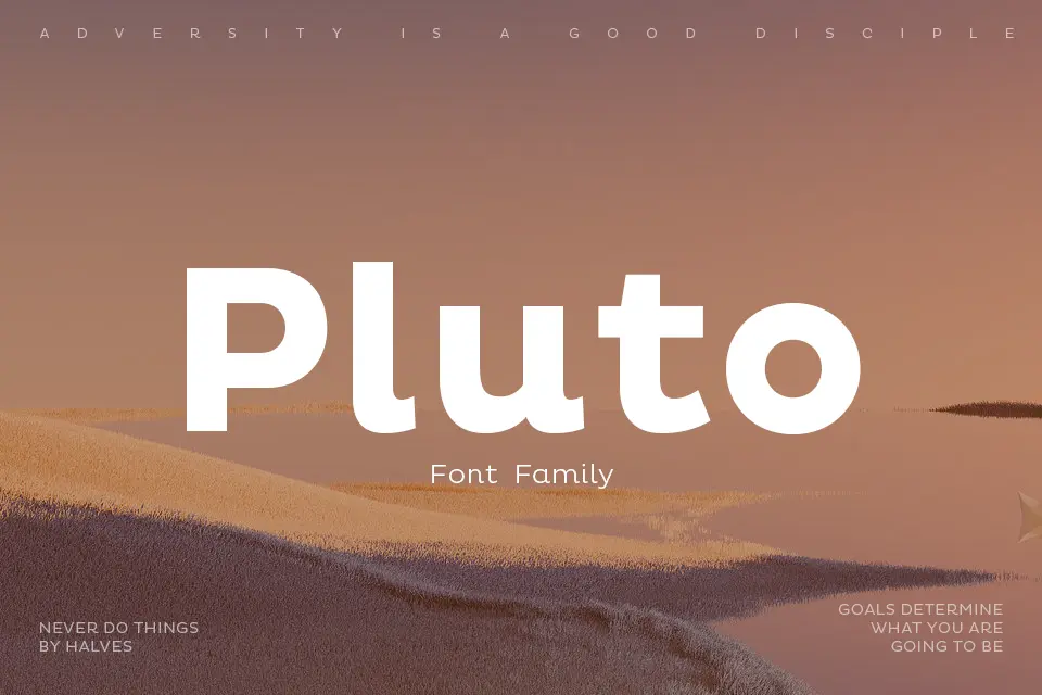

About Pluto Font
I first tried Pluto Font while working on a clean interface for a small tech brand. I needed something friendly, modern, and simple, without looking childish or too neutral. This typeface caught my eye because it felt soft around the edges, yet still tidy enough for serious work.
What pulled me in was its calm tone. The shapes looked approachable, but not goofy. I tested it in headings, buttons, and short bits of copy to see if it could carry a full visual identity. For that project and for my review at Free Fonts Lab, I wanted to see how flexible it really was in real layouts.
Font Style & Design Analysis
Pluto Font is a sans-serif typeface with a gentle, rounded voice. The letters feel geometric at first, but the corners are softened just enough to add warmth. It does not shout. Instead, it gives a steady, balanced rhythm that works well in modern, clean typography systems.
The exact origin of this font is not fully clear to me, so I will treat the designer as unknown. What matters in this case is less the name behind it and more how the font behaves in practice. I focused on testing its shapes, spacing, and overall usability instead of relying on designer reputation.
The letterforms are open and airy, with circular counters that help readability on screen. Spacing feels slightly generous, which gives text room to breathe, especially in UI labels and headings. In heavier weights, it gains presence but never feels harsh. In very long paragraphs, though, that softness can feel a bit too relaxed, so I prefer it for short to medium text rather than dense reading.
Where Can You Use Pluto Font?
In real use, I found Pluto Font works well for digital products, apps, and landing pages. At large sizes, the rounded sans-serif forms make headlines feel friendly and modern. It also suits brand systems that want to look open and human, especially for tech, wellness, and education projects.
In smaller sizes, the open letterforms hold up fairly well, especially on screens with good resolution. Labels, menus, and short notes stay readable, though I would avoid very tiny body text. When I needed longer copy, I sometimes paired it with a more neutral sans-serif or a light serif to keep reading flow calm and steady.
The font family fits best with audiences who respond to clarity without stiffness. I liked it in layouts that use soft colours, rounded icons, and generous white space. It pairs nicely with a sharper display typeface for contrast, or with a simple geometric font family for structure. In branding, it works when a team wants warmth but still values clear, rational typography.
Font License
Before using Pluto Font in any project, I always suggest checking the current licence on the official source. Terms for personal and commercial use can change over time. Do not assume it is free for client work without reading the licence details carefully.
My honest takeaway as Ayan Farabi: this font shines when you need a gentle, modern voice that stays practical, as long as you use it in the right context and do not push it into heavy reading roles.


Leave a Reply