

About Podium Sharp Font
I first tried Podium Sharp Font while working on a sports event poster that needed a strong, clean voice. I wanted something modern but not cold, sharp but still readable. The name caught my eye, and the shapes felt like they could carry energy without looking too aggressive or flashy.
I tested it across a full layout, from bold headlines to smaller subheads and captions. The way it held its structure at different sizes made me curious to explore it more deeply. That trial turned into a longer study, which led me to write about it here for Free Fonts Lab.
Font Style & Design Analysis
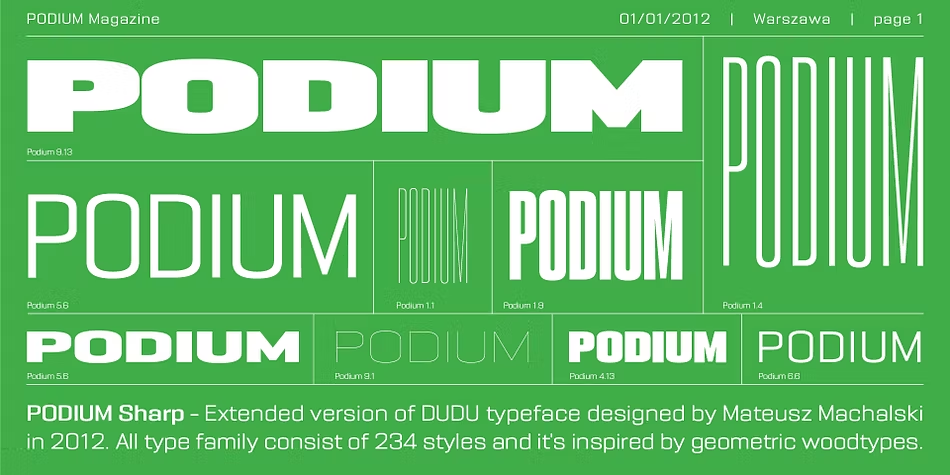
Podium Sharp Font is a sans-serif typeface with a clear, focused, and slightly technical look. The lines feel precise, with a firm sense of structure that suggests order and control. It leans toward a contemporary, performance-driven style, which suits themes like sports, tech, and modern branding very well.
The designer is unknown, but the design logic feels considered rather than random. There is a clear system behind the shapes. The consistent stroke weight and careful corner treatments show that someone thought about how this font family would behave in real layouts, not just as a logo or a title.
The letterforms have tight, tidy curves and firm straight strokes, which create a confident rhythm across a line of text. Spacing is on the snug side, which helps headlines feel compact and punchy. This works nicely in bold settings but can feel a bit rigid in very long body text. The mood is energetic and professional, although it does not carry much warmth. That makes it strong for functional design, but less ideal for soft, emotional brands.
Where Can You Use Podium Sharp Font?
Podium Sharp Font suits projects where clarity and strength matter more than charm or decoration. I found it very effective for posters, banners, and social media graphics where you only have a second to grab attention. Its sans-serif structure keeps things clean, while the sharp detailing adds personality without going over the top.
In large sizes, the edges and angles come alive and give titles a sense of speed and intention. On smaller text, such as captions or UI labels, it stays legible, but you need to watch spacing. I like giving it a little extra tracking for small sizes to avoid a cramped look, especially in dense layouts.
This font works well for sports branding, esports graphics, tech products, and bold corporate decks. It can pair nicely with a softer serif or a simple geometric sans for body copy, to balance its firm tone. When I build a visual identity with it, I often use Podium Sharp Font for headlines and key numbers, then support it with a calmer secondary font family underneath.
Font License
The licence for Podium Sharp Font can change depending on where you get it, and terms may differ for personal and commercial projects. I always recommend checking the official source for the latest licence details before using it in client work or large campaigns.
For me, Podium Sharp Font is a solid choice when I need structured energy and clear impact, as long as I handle spacing and pairing with care.


Leave a Reply