

About Poleno Font
I first reached for Poleno Font while working on a bold event poster that needed a strong title. The client wanted something loud, but not cheesy. I was browsing options for a punchy display look and this typeface kept catching my eye with its sharp presence.
What drew me in was the way the font family filled space with confidence. The letters felt compact yet clear, and the rhythm looked powerful on screen. I decided to test it deeper for several layouts, then wrote up my notes for Free Fonts Lab so other designers could judge it with real use in mind.
Font Style & Design Analysis
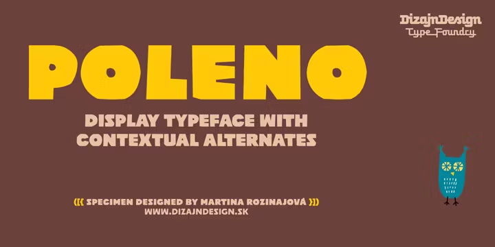
Poleno Font is a pure display typeface, built to grab attention rather than sit quietly in body text. The font style has a blocky, condensed structure that makes headlines feel intense and focused. Strokes are firm, edges are clean, and the whole look leans towards a modern, slightly industrial mood.
The exact creator of this typeface is designer unknown, at least from what I could verify through common font sources. Without clear foundry notes, I relied fully on visual testing instead of backstory. That forced me to judge the typography only by how it behaves in real layouts, which is often the most honest way to review a display design.
The letterforms have tight spacing and a strong vertical rhythm, which helps big words lock together nicely. Uppercase characters feel especially powerful, while lowercase can look a bit dense in longer lines. Curves are minimal, so the mood stays serious and assertive. This gives the Poleno Font font family great strength in headlines, but it also means limited comfort for long reading or soft, friendly branding.
Where Can You Use Poleno Font?
I see Poleno Font working best in posters, banners, and social graphics where impact matters more than subtlety. At large sizes, the display structure really shines, especially on dark backgrounds with high contrast. The firm shapes hold up well on screens and in print, even when viewed from a distance.
At medium sizes, such as section headers, it can still perform nicely if you give it enough line spacing and breathing room. I would avoid using it for long paragraphs or UI labels, as the condensed spacing starts to feel heavy on the eyes. It speaks loudly, so it is better as a headline voice rather than a constant narrator.
For pairing, I had good results combining this display typeface with a simple sans-serif for body copy. Clean, neutral text lets the bold letterforms do the main visual work. It suits music event branding, streetwear visuals, tech-themed posters, and any visual identity that needs a direct, tough tone. For softer or luxury brands, I would probably choose something less rigid.
Font License
Before you use Poleno Font in any project, check the licence terms from the original source. Some versions allow personal use only, while commercial work may need a paid or extended licence. I always confirm the current licence details, as terms can change without notice. My simple rule: never rely on guesses.
After testing it in real layouts, my honest take is that this display typeface is a strong tool when you need firm, focused headlines. I will keep it in my toolkit for bold posters and title work, but I use it carefully and only where its intense voice truly fits the story.


Leave a Reply