
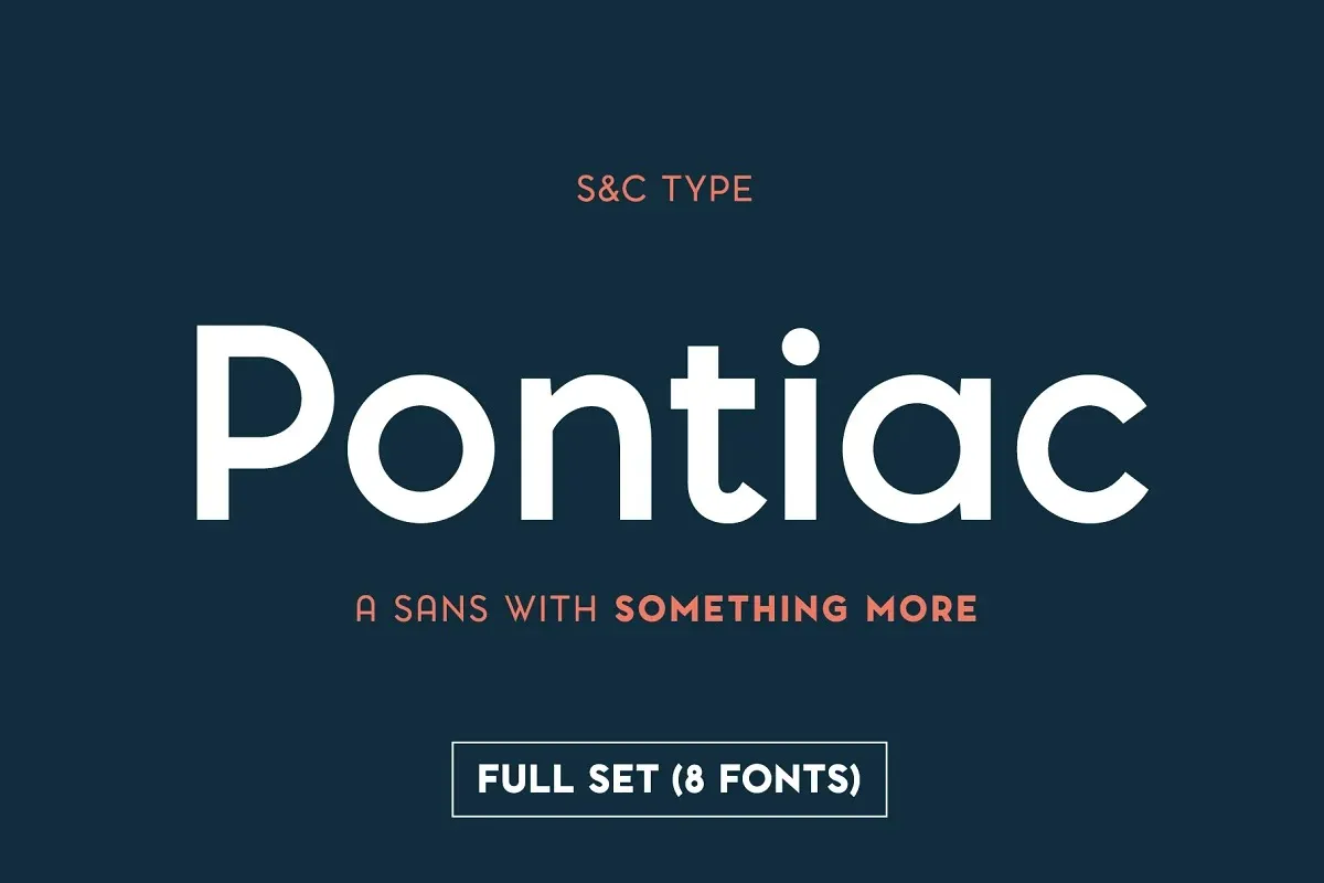

About Pontiac Font
I first tried Pontiac Font while working on a clean poster for a small tech event. I needed a calm, modern typeface that felt friendly but not childish. The name sounded strong, so I installed it and tested it across titles, subtitles, and short text blocks to see how it behaved in real layouts.
What kept me using this font was its balance between warmth and structure. It looked simple on the surface, yet the shapes had enough character to stand out. I wrote this review for Free Fonts Lab because I know many designers hunt for a reliable, modern sans that does not shout, but still feels designed with care.
Font Style & Design Analysis
Pontiac Font is a sans-serif typeface with a soft, geometric voice. The letterforms feel built from clean shapes, but the corners are not harsh. Strokes look even and calm, giving the font family a steady tone. It sits somewhere between strict geometric and friendly human style, which makes it easy to trust on first read.
The designer information is not clearly stated in most sources, so for this review I treat it as designer unknown. From a typographer’s eye, it feels like the work of someone who studied modern branding trends closely. The decisions in spacing, curve tension, and width control all suggest an experienced hand, even if the credits are not obvious.
The letterforms show tight control: rounded shapes like “O” and “C” feel slightly squarish, while verticals stay firm but not stiff. Spacing is modest and even, which helps the rhythm in headlines. In small text, the compact spacing can feel a bit dense if lines are too tight. As a sans-serif design, it shines in short copy, titles, buttons, and UI labels, but is less ideal for long, book-style reading.
Where Can You Use Pontiac Font?
In my testing, Pontiac Font worked best in branding systems that need a modern, neutral voice. It suits tech start-ups, lifestyle products, and clean editorial layouts. At large sizes, the shapes look confident and tidy, which makes it a strong choice for logos, hero headlines, and packaging titles where clarity matters.
At smaller sizes, like UI text or captions, the font stays readable, but it needs enough line spacing and breathing room. If you push it too small, the compact forms can start to feel a bit tight. I often pair it with a softer serif for body copy, using Pontiac Font for navigation, subheads, and data points. This contrast gives structure without heavy visual noise.
For posters, slides, and social graphics, it handles simple layouts very well. It also works for education, minimal fashion, and clean corporate decks where you want quiet confidence instead of loud personality. I would not choose it for playful children’s brands or very expressive music posters. Its strength is a clear, modern visual identity that stays out of the way of the message.
Font License
Before you use Pontiac Font in client work or commercial projects, always check the official licence from the original source. Terms can change, and personal use does not always cover branding, print runs, or app embedding. I always confirm the licence details first, then add the font to my active project toolkit.
My main takeaway as Ayan Farabi: Pontiac Font is a solid, modern sans I trust for clean, structured projects, as long as I handle size and spacing with care.


Leave a Reply