
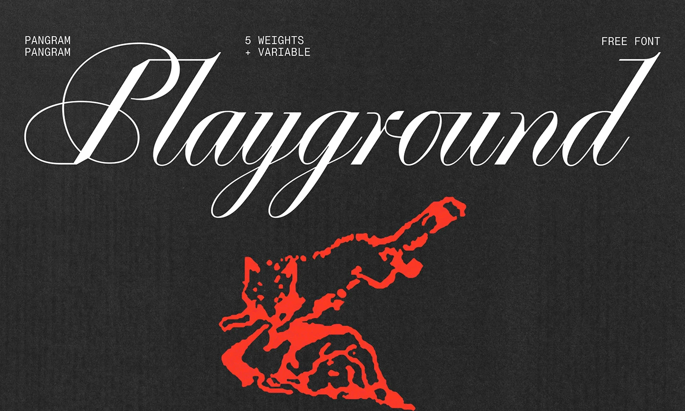

About Pp Playground Font
I came across Pp Playground Font while searching for a loose, playful script for a children’s event poster. I needed something that felt fun but still readable, with a hand-drawn feel that did not look messy or rushed. The name caught my eye first, but the shapes kept me interested.
I decided to test it on a bright, illustration-heavy layout for Free Fonts Lab. I wanted to see if the font could balance bold colours, simple icons, and short, punchy headlines. It gave the poster a relaxed mood without turning the design into a joke, which made me curious enough to explore it in more detail.
Font Style & Design Analysis
This typeface is a script font, and its style leans towards casual, rounded brush writing. The strokes feel smooth and confident, like quick marker lines drawn by someone who knows their hand. It has a soft, friendly energy, and that comes through in both the curves and the generous counters.
The exact creator of this font is designer unknown, which does limit context about its original intent or system. That said, my testing focused less on history and more on how the script behaves in layouts, how it scales, and how it plays with other typefaces in a typical design workflow.
The letterforms have a relaxed rhythm, with medium contrast between thick and thin areas. Spacing sits on the open side, which keeps words from turning into scribbles, even when letters connect. In short headlines, the flow feels natural and bouncy. In longer lines, the script category shows its limits, as reading speed drops and the playful curves become visually heavy.
Where Can You Use Pp Playground Font?
I found Pp Playground Font most effective in medium to large sizes, especially on posters, banners, and social media graphics. The script shapes need enough space to breathe, otherwise the loops start to blend together. At larger scales, the character of each stroke becomes a design element on its own.
For branding, this script font works best for young, casual, or playful identities. Think children’s events, informal cafés, toy brands, or creative workshops. I would not use it for serious corporate work, but it can sit nicely in sub-marks, wordmarks for small projects, or short taglines paired with a clean sans-serif font family.
In layouts, I usually pair this script with a simple sans-serif for body text and supporting labels. The contrast between the flowing letterforms and a straight, neutral typeface keeps the visual identity grounded. I avoid using it for long paragraphs or UI text. The font style shines when it leads the message, not when it carries all of it.
Font License
The licensing for Pp Playground Font can change over time, and different sources may offer different terms. Before using it in client work or commercial projects, I always recommend checking the official licence details carefully. Make sure personal, commercial, and web or app usage are clearly allowed for your specific case.
My personal takeaway as Ayan Farabi: I reach for this script when I need friendly energy in short bursts, and I let a calmer companion font do the heavy lifting.


Leave a Reply