

About Press Gothic Font
I came across Press Gothic Font while I was searching for a bold, tight typeface for a poster series based on vintage newspapers. I wanted something loud, compact, and slightly rough around the edges, but not cartoonish. This font caught my eye because it looked strong without feeling heavy or clumsy.
As I tested it in layouts for Free Fonts Lab, I liked how the letters stacked into dense blocks of type. It helped me build strong hierarchy very quickly. I decided to put it through a full trial on headers, short pull quotes, and tight grids to see how far I could push it in real projects.
Font Style & Design Analysis
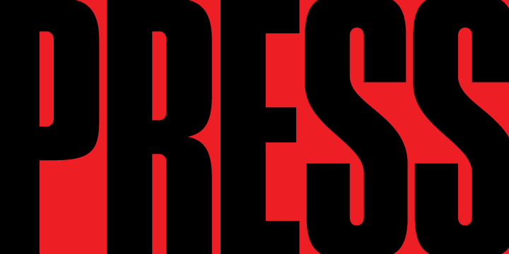
Press Gothic Font is a pure display typeface, and it shows from the first line you set. The letterforms sit very tall and narrow, with a compressed feel that pulls everything inward. It has a bold, industrial look that reminds me of old press headlines and stamped labels, built for impact rather than calm reading.
The exact origin of this font is designer unknown, but the design language is quite clear. It feels inspired by mid‑century press type and mechanical printing, where space was limited and every character had to shout. The font family does not try to be neutral; it leans fully into a dramatic, poster-like voice.
Looking closely at the letterforms, the vertical strokes are thick and assertive, with tight spacing that creates a dense rhythm. Rounded characters like O and C look slightly squared, which adds to the industrial mood. This display font works best with short words, strong verbs, and compact headers. Long text blocks become hard to read, and small sizes quickly lose clarity, so it is a tool for punchy typography, not body copy.
Where Can You Use Press Gothic Font?
I find Press Gothic Font most convincing in posters, event graphics, and bold cover designs. At large sizes, its compressed shapes turn headlines into solid blocks that anchor the page. It works well when you want a loud, urgent voice, like a gig poster, protest graphic, or sports banner, where attention comes first.
In smaller headings or UI elements, you need to be careful. The tight spacing and heavy weight can make letters start to blend if the size drops too much. I usually reserve it for main titles and short labels, then pair it with a calmer sans-serif for body text. The contrast between a heavy display face and a clean supporting font keeps the visual identity readable and organised.
It also works nicely in editorial layouts that nod to old newspapers or zines. When I mix it with strong grids, high contrast colour blocks, and simple photography, the typography feels sharp and intentional. For brands, I would only use it as an accent font style, not a core font family, especially when designing for audiences that need clear reading comfort.
Font License
The licence terms for Press Gothic Font can change depending on the source, so I never assume it is free for every use. Before using it in client work or commercial projects, I always check the official licence details and confirm whether personal, editorial, or commercial rights are clearly covered. That small step avoids problems later and keeps projects safe.
My honest takeaway as Ayan Farabi: I reach for this font when I need raw, compressed power, but I use it with care and give it space to breathe.


Leave a Reply