

About Pretty Girl Font
I came across Pretty Girl Font while working on a soft, feminine invitation set for a small event brand. I needed a script that felt friendly, not fake or over-polished. Many options looked too busy or too childish, so I kept searching until this one caught my eye.
The curves felt gentle, and the strokes had a relaxed flow that suited casual but neat layouts. I decided to test it for headlines, name treatments, and short phrases. At Free Fonts Lab, I often try fonts in quick mockups first. This one made me slow down and explore a bit more, which is usually a good sign.
Font Style & Design Analysis
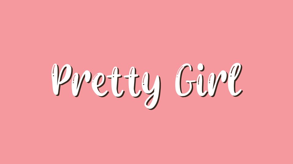
Pretty Girl Font is a script typeface with a smooth, handwritten flavour and soft, looping strokes. The letters lean slightly, giving a sense of movement without feeling rushed. It aims for playful elegance, with rounded forms that suggest warmth and friendliness rather than strict formality.
The designer is unknown, at least from the sources I checked while testing. Because of that, I treated it as a more experimental option in my workflow. I used it in staging files, mood boards, and concept presentations, rather than locking it into a final brand system without closer licence checks.
The letterforms show open counters, especially in a, e, and o, which keeps the script readable in short lines. Baseline connections are mostly consistent, though a few pairs can feel slightly uneven at tighter tracking. The rhythm works nicely in 3–5 word phrases. It shines in titles, logos, and wordmarks but struggles in long paragraphs, which is typical for a script font family.
Where Can You Use Pretty Girl Font?
In my tests, Pretty Girl Font worked best for branding aimed at young or lifestyle-focused audiences. Think beauty products, small boutiques, handmade goods, or personal stationery. At larger sizes, the curves look charming and inviting, making it a good choice for hero text, packaging labels, and cover titles.
At smaller sizes, the connecting strokes start to blur, especially on screens. I would avoid using it below 14–16pt for body copy. Instead, I paired it with a clean sans-serif for supporting text. This balance kept the visual identity soft but readable. The script carried the personality, while the simpler font handled all the practical information.
For social media graphics, name logos, signatures, and wedding or event designs, it can perform quite well. I also tried it on simple quote posts and Instagram highlight covers, where short words and generous spacing helped the shapes breathe. It is less suited to strict corporate work, but it has a place in relaxed, human-centred layouts.
Font License
Licensing for Pretty Girl Font can vary depending on where you download it. Some sources may allow personal use only, while others may offer wider rights. I always recommend checking the official licence details before using it in any client or commercial project.
After testing this typeface in a few mockups, I see it as a gentle, expressive option when I need a soft script voice without too much drama. Used in the right places and sizes, it adds charm without shouting, which is something I always appreciate as a designer.


Leave a Reply