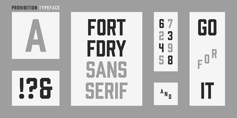
About Prohibition Font
I first tried the Prohibition Font while working on a small craft beer label for a local client. They wanted something bold, simple, and slightly vintage, but not too decorative. I needed a typeface that felt strong on a busy background and stayed clear at a distance.
That search led me to this sans-serif design, and it caught my eye right away. The blocky shapes, tight rhythm, and no-nonsense structure made it feel dependable. I tested it in a few mockups for Free Fonts Lab, and it surprised me with how stable and consistent it looked across different layouts.
Font Style & Design Analysis
Prohibition Font is a sans-serif typeface with a firm, industrial voice. The letters look straight, clean, and compact, with very little softness. It clearly draws from early 20th‑century signage, especially from bars, factories, and warehouse branding. The style feels purposeful, as if every stroke must work hard on the page.
The designer is unknown, at least from the sources I could check with confidence. That said, the type family feels carefully planned rather than random or rushed. The weight and proportions suggest someone who studied old poster lettering and then translated that structure into a modern digital font family.
The letterforms stay wide and blocky, with short terminals and almost no contrast in stroke width. Spacing is on the tight side, which creates a solid text wall in uppercase. This gives the Prohibition Font a strong rhythm, but it can feel heavy in long lines. It shines in short words, logos, and headings, yet feels less comfortable for dense body copy or long paragraphs.
Where Can You Use Prohibition Font?
I see Prohibition Font working best in branding that needs a tough, clear voice. Think beer labels, coffee packaging, burger shops, bar signage, or vintage‑inspired products. It also fits posters for events like markets, gigs, or sports nights. In these cases, the bold sans-serif shapes grab attention fast and stay readable.
At large sizes, its blocky forms look very controlled and striking. On storefront windows, menus, banners, and social media graphics, the font holds its shape even with textured backgrounds. At smaller sizes, especially in long sentences, its dense spacing can feel a bit cramped. I usually reserve it for headings, short taglines, and punchy callouts.
When I pair this sans-serif font, I like using a softer serif or a neutral grotesque for body text. That contrast helps the heavy title style stand out without tiring the eye. Simple layouts with strong grids, flat colours, and minimal decoration tend to work best, because they let the typeface carry the mood and visual identity.
Font License
The licence for Prohibition Font can vary depending on where you download it from. I never assume it is free for commercial work, even if it is free to test. Always read the official licence terms carefully and confirm whether you are allowed to use it in paid client projects or large branding systems.
My main takeaway as Ayan Farabi: I reach for this font when I need impact, grit, and clarity in short bursts, but I avoid using it for long reading or subtle, quiet brands.


Leave a Reply