

About Protest Font
I came across Protest Font while I was searching for a clean, bold typeface for a social campaign layout. I wanted something strong, but not angry or messy. The name suggested noise and chaos, yet the shapes felt controlled and modern. That contrast made me curious.
I decided to test it on a poster series and a simple web header mock-up for Free Fonts Lab. I wanted to see if it could carry a clear message without shouting. During that test, I paid close attention to legibility, rhythm, and how it behaved with tight grids and simple colour blocks.
Font Style & Design Analysis
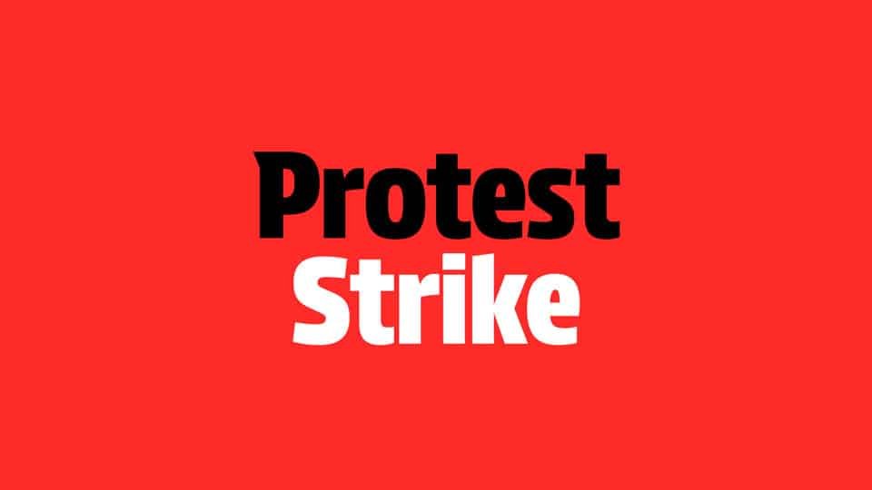
This is a sans-serif typeface with a sturdy, blocky presence. The design feels straightforward and geometric, but it does not look cold. Strokes are even, counters are open, and the overall silhouette feels compact. It gives a sense of firmness that suits slogans, titles, and short, impactful lines.
The designer is unknown, so I approached it with no expectations or brand story in mind. That actually helped me judge it only by its shapes and performance. I looked at the font family as a neutral tool rather than a famous name, which made its small quirks more noticeable during testing.
The letterforms are simple, with low contrast and generous internal spaces. Spacing is on the tighter side, which helps headlines feel solid, but it can look cramped in dense paragraphs. The rhythm is steady, so the eye moves easily across short lines. It works best in bold statements, while long body text feels a bit stiff. As a sans-serif, it leans more towards structure and clarity than warmth or playfulness.
Where Can You Use Protest Font?
I found Protest Font most comfortable in roles where messages must be clear and firm. It works well on posters, banners, and social graphics for causes, events, or campaigns. Large sizes show the clean geometry nicely and give room for white space around the words. It suits audiences that expect clarity more than decoration.
At medium sizes, like subheadings or bold pull quotes, it still holds up well. On screens, it reads clearly in short bursts, such as buttons, labels, and hero text. I would avoid using it for long articles or dense captions, as the tight spacing and rigid shapes can tire the eye after a few lines.
For pairing, I like combining this typeface with a softer serif or a light humanist sans for body text. That balance keeps the layout friendly while letting Protest Font carry the main message. In branding, it can support visual identity systems that need a strong primary voice, especially when used with simple colours and clear grids.
Font License
The licensing terms for Protest Font can change depending on the source where you download it. Do not assume that personal use includes commercial projects. Always read the current licence notes from the official provider before using it in client work, paid campaigns, or large-scale branding.
My honest takeaway as Ayan Farabi: I reach for this font when I need a steady, confident headline that stays readable and calm, even when the message is loud.


Leave a Reply