

About Qaskin Font
I came across Qaskin Font while searching for a soft, romantic script for a wedding stationery set. I needed something elegant, but not too fancy or hard to read. The curves felt warm and friendly, so I decided to test it in headings, names, and short phrases.
During that project, the font brought a gentle flow to the layout and helped link the couple’s story with their visual identity. I later tried it in a small logo study for Free Fonts Lab, just to see how flexible it could be outside of formal invites.
Font Style & Design Analysis
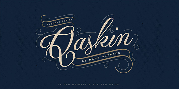
Qaskin Font is a script typeface with smooth, looping strokes and a relaxed handwritten feel. The letters lean slightly, which gives the font style a sense of motion and rhythm. It sits somewhere between casual and elegant, so it does not look stiff or overly decorative.
The designer is unknown, at least from the sources I could check while testing the font family. That uncertainty does not affect how it performs, but it does mean I am extra careful about licensing, support, and long-term use in client work.
The letterforms have wide curves, open counters, and a friendly baseline bounce. Spacing feels fairly even in large sizes, though some pairs need manual kerning in tight logos. The script structure makes it strong for short words and names, but longer texts can look busy. It shines in display roles, not in dense paragraphs.
Where Can You Use Qaskin Font?
I see Qaskin Font working well in wedding invitations, baby shower cards, and soft lifestyle branding. At large sizes, the script shapes read clearly and show nice detail in the curves. On social graphics or quote posts, it adds an instant personal touch without feeling messy.
For brand work, I would use this script font in logos for bakeries, beauty salons, gift shops, or handmade product labels. Pair it with a clean sans-serif typeface for body text and menus, so the layouts stay balanced. The script style carries emotion, while the supporting font keeps information clear.
At small sizes, some fine strokes can thin out, especially on low-resolution screens. I avoid using it for long captions or dense packaging copy. Instead, I let it lead in headings, product names, and short taglines. When tracked slightly wider and given breathing room, the typography feels calm, friendly, and approachable.
Font License
The licence details for Qaskin Font may differ between sources, so I never assume terms for personal or commercial work. Before using it in any paid project, I always check the official licence text from the original provider and confirm that the allowed usage matches my client’s needs.
For me, Qaskin Font is a gentle script I reach for when I want warmth and softness, as long as the project is short-form and the licence is crystal clear.


Leave a Reply