
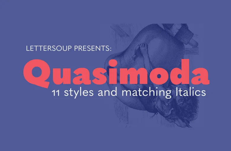

About Quasimoda Font
I first tried the Quasimoda Font while working on a clean layout for a lifestyle brand guide. I needed a neutral, modern voice that did not fight with photos or colour. This typeface caught my eye because it looked calm, simple, and still a bit stylish.
I tested it across headings, body text, and captions for a Free Fonts Lab mock project. I wanted to see if it could hold a whole visual system on its own. The more I used it, the more its quiet balance stood out. It felt dependable, without shouting for attention.
Font Style & Design Analysis
Quasimoda Font is a sans-serif typeface with a clean, contemporary look. The shapes feel geometric at first, but there is enough softness to keep it human. Strokes are steady, with no strange quirks, so the font family reads as straightforward and modern.
The exact creator of this typeface was not clearly stated in the material I reviewed, so for now I will note the designer as unknown. That said, the work feels informed by classic European modernism, with a focus on clarity and even rhythm in the typography.
The letterforms show generous counters and open apertures, especially in characters like “a”, “e”, and “s”. Spacing is quite even, which helps text blocks look tidy. In display sizes, the rhythm feels structured and controlled. In smaller sizes, it stays readable, though long paragraphs need enough line spacing. Its strength lies in clear information design and confident, understated branding, while very expressive or decorative projects may need a more characterful partner.
Where Can You Use Quasimoda Font?
I see Quasimoda Font working well in identity systems that need a calm, professional tone. Because it is a sans-serif font, it suits tech brands, lifestyle products, portfolios, and editorial layouts. It does not steal focus from imagery, which helps when photos or illustrations carry most of the story.
In large sizes, such as hero headlines, posters, or UI headers, its clean letterforms feel sharp and controlled. It pairs nicely with a contrasting serif for long-form reading, or with a subtle script accent for personal touches like signatures or quotes. I found tight but not cramped tracking works best for bold titles.
At small sizes, like captions, menus, and UI labels, the open shapes keep things legible, especially on screens. For dense text, I recommend slightly larger body copy and a comfortable line height. This font family suits audiences who expect clarity and ease: product users, readers of minimalist blogs, design-aware clients, and anyone who values simple, clear typography.
Font License
The licence for Quasimoda Font can differ between sources and versions, especially for desktop, web, or app use. I strongly recommend checking the official distributor for the latest licence terms, and making sure any personal, client, or commercial project is fully covered before you ship work.
For me, this typeface has become a quiet option I keep in mind when a project needs order, clarity, and a modern voice without drama. It is not a show-off font, and that is exactly why it can work so well.


Leave a Reply