
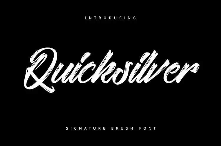

About Quicksilver Font
I came across Quicksilver Font while searching for a bold brush style for a poster series. I needed something loud, fast, and a bit rough, but still readable from a distance. The name caught my eye first, but the strokes and movement kept me looking.
I decided to test it on a music event layout for Free Fonts Lab, mixing it with a clean sans-serif for body text. I wanted to see if this brush font could carry strong headlines without overwhelming the rest of the page. It gave the design a punchy, street-art feel that felt natural, not forced.
Font Style & Design Analysis
This typeface is a brush font, and it shows that from the first letter. The strokes feel quick and confident, like paint dragged across a wall. You see sharp angles, broken edges, and a sense of speed in every word. It leans heavily into energy rather than neat, polished structure.
The exact creator of this font is designer unknown, which makes it a bit harder to place in a design tradition. Without a known foundry or designer, I rely only on what I see on screen and in print. From that, it feels like a font built for impact more than subtlety or long reading.
The letterforms have strong contrast between thick and thin parts, giving each word a jagged rhythm. Spacing is fairly tight, so words look compact and solid, which is great for short headlines. At smaller sizes, the texture can blur, and some details get lost. Its main strengths are attitude, motion, and personality, but it is not a good choice for long paragraphs or tiny captions.
Where Can You Use Quicksilver Font?
I find this brush font most useful for event posters, album covers, streetwear graphics, and bold social media banners. When you use it large, the rough strokes and edges really shine. It works well when you want to hint at noise, movement, or rebellion. It speaks to younger, more casual audiences.
In small sizes, Quicksilver Font loses some clarity, especially on screens with lower resolution. For that reason, I keep it for titles, logos, and short phrases only. For body text, I pair it with a simple sans-serif or a neutral serif, so the layout feels balanced. The calm supporting font lets the brush style take the spotlight.
It suits branding for music festivals, skate or street brands, extreme sports, or any project that wants a wild, hand-painted feel. On darker backgrounds, the strokes look very strong, especially in white or bright colours. In clean, minimal layouts, it can act as the one loud element that breaks the grid and adds life.
Font License
Before you use Quicksilver Font for client work or any commercial project, always check the licence from the original source. Terms can change, and some uses may require paid permission. For personal or test work, read the usage notes carefully so you stay on the safe side.
After testing it in real layouts, I see this font as a focused tool: great for loud, short messages when you need raw energy, but best used with restraint.


Leave a Reply