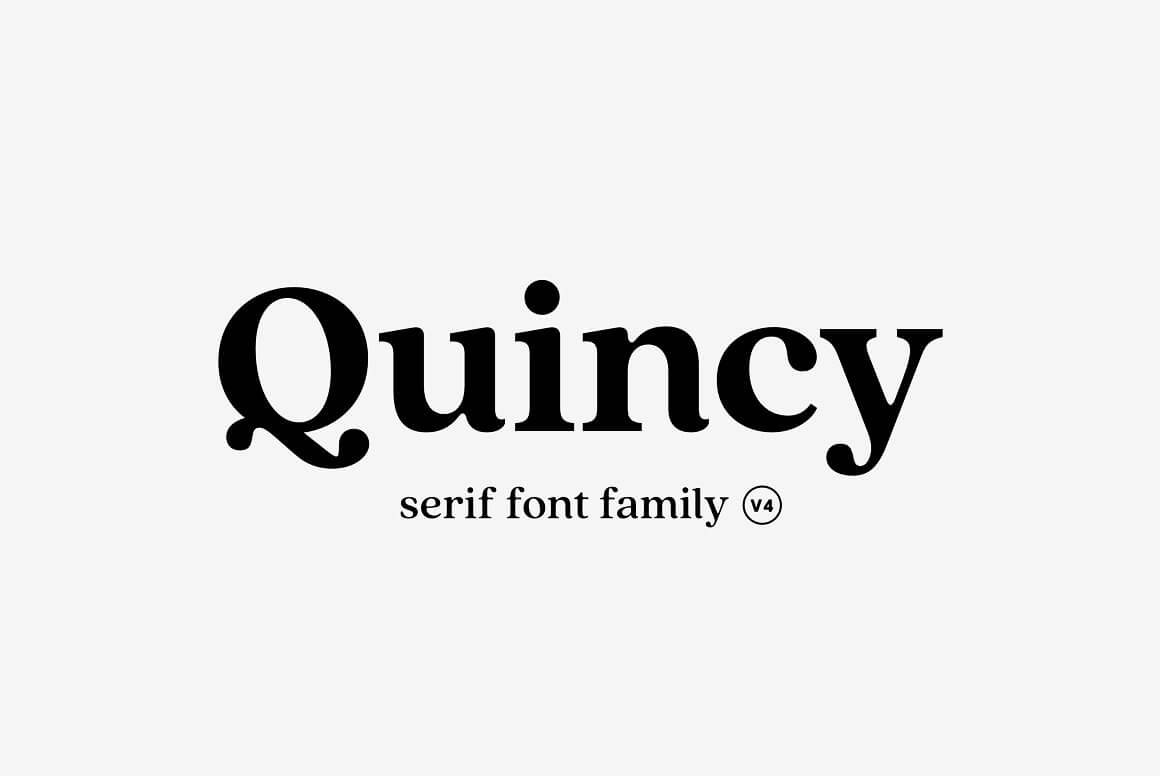
About Quincy Font
I first reached for Quincy Font while building a calm, bookish brand for a small stationery shop. The client wanted something warm, readable, and slightly nostalgic, without drifting into anything too decorative or cute. Quincy caught my eye because it felt familiar yet fresh, like a modern take on classic book type.
As I tested it in mockups for logos, packaging, and simple layouts, I noticed how steady and relaxed it looked. The font family gave me enough weights to explore hierarchy, but it stayed consistent in tone. For a review on Free Fonts Lab, I spent extra time checking how it behaved in both print-style layouts and simple digital screens.
Font Style & Design Analysis
Quincy Font is a serif typeface with a gentle, human feel. The serifs are soft and slightly rounded, which keeps the overall look friendly rather than strict. It has a clear book-inspired mood, with proportions that remind me of traditional text type, but with smoother curves and less contrast than very old-style faces.
The designer is not clearly credited in the material I found, so I have to treat it as designer unknown. That said, the work feels careful and considered. The rhythm across the font style suggests someone who understands editorial typography quite well, especially in the way the lowercase forms line up into neat, readable lines.
The letterforms have moderate contrast, with open counters and a fairly generous x-height. This helps the serif details stay visible without feeling sharp. Spacing is on the comfortable side, which supports long reading but can look a bit airy in all-caps. It shines in text, pull quotes, and subheadings, but is less suited to ultra-tight, loud display layouts where you need strong impact in very large sizes.
Where Can You Use Quincy Font?
I find Quincy Font works best in projects that need trust and warmth at the same time. Think book covers, brand identities for cafés, stationery, editorial layouts, and portfolio sites. At medium sizes, like headings and subheadings, the serif details give just enough personality to stand out without distracting from the core message.
In long paragraphs, the serif structure helps guide the eye, so it feels natural in reading-heavy layouts. For small text, it stays readable, though I recommend a bit more line spacing to avoid a cramped look. At very large display sizes, you see more of its softness, which can be great for calm brands but less ideal for sharp, tech-focused visual identities.
For pairing, I usually match this serif with a clean sans-serif for UI elements, captions, or navigation. A neutral geometric or humanist sans helps keep the system balanced. Quincy handles the expressive, content-driven parts, while the partner font supports structure. Used this way, it creates a clear, friendly visual identity that feels steady across both print and screen.
Font License
The licence terms for Quincy Font can differ depending on where you obtain it and which version you use. Do not assume it is free for commercial work, even if a free download is available. Always read the official licence carefully and confirm that it covers your specific personal or client projects.
My honest takeaway as Ayan Farabi: Quincy is a solid, readable serif that I trust for quiet, text-led work, as long as the project does not demand a loud, highly distinctive display voice.


Leave a Reply