

About Rastanty Cortez Font
My first reaction to the Rastanty Cortez Font was simple: it felt warm and romantic. The curves looked soft, and the strokes felt like careful handwriting on a gift card. That emotional pull made me curious, so I decided to test it in a few real client mockups and personal branding drafts.
What drew me in most was the mix of elegance and ease. It has that modern script look, but it does not feel stiff or overpolished. I tried it on logo sketches, social media graphics, and quote posters for a Free Fonts Lab study. Each test helped me see where this script typeface shines and where it needs more care.
Font Style & Design Analysis
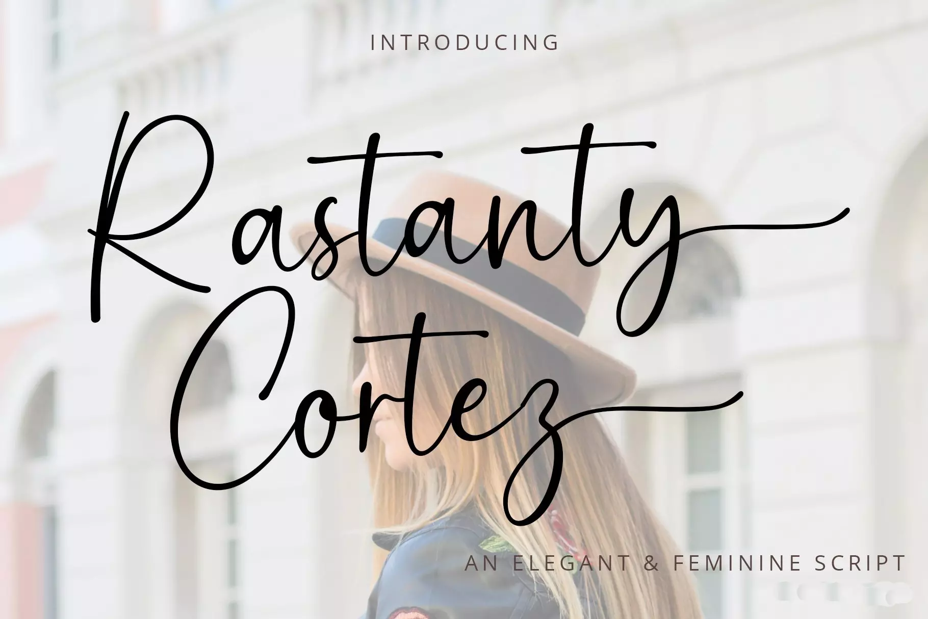
From my use, this is clearly a script font with a calligraphy flavour and a modern, romantic tone. The strokes flow like ink from a brush pen, with gentle pressure changes that give a soft rhythm. It sits strongly in the display space, so I treat it as a headline or accent typeface rather than a general-purpose font family.
I could not confirm a clear foundry or creator, so for now I will mark the designer unknown. That happens often with trending decorative scripts. When I work with a font like this, I always keep that in mind and double-check the source before placing it in any commercial branding work.
Looking closely at the letterforms, the lowercase shapes feel friendly and flowing, with long tails and smooth joins between strokes. Capitals are showy and work well as the first letter in names or short words. Spacing leans tight, especially in pairs like “st”, “tt” and “rz”, which adds charm but can reduce clarity at very small sizes. The mood leans romantic, feminine, and slightly luxury, so it fits some visual identity styles much better than others.
Where Can You Use Rastanty Cortez Font?
From a practical point of view, I would use Rastanty Cortez Font mainly for display typography. It works best on invitation cards, wedding branding, boutique logos, and product labels for beauty or lifestyle goods. On large signage, covers, and hero images, those sweeping strokes read clearly and give a personal, handwritten feel.
At medium sizes, such as social media posts or posters, it still works well if you keep the main words short. I avoid using it for long quotes or dense body text, because the script style becomes tiring to read. Pairing it with a clean sans-serif or a light serif font helps balance the design and keeps the message easy to follow.
When the font gets too small, the fine curves and tight spacing start to blur, especially on screens with lower resolution. For that reason, I would not use it in paragraphs, menus, or UI labels. It feels more suited to audiences looking for romance, fashion, crafts, or high-end packaging. In those spaces, Rastanty Cortez Font can become a strong signature element in the layout.
Font License
From what I could gather, the licence for Rastanty Cortez Font may differ between personal and commercial use. Some sources offer it for free personal projects, but terms can change over time. Before using it in any client work or paid project, I strongly suggest checking the official licence details on the original source. As a designer, I treat that step as part of my normal workflow and creative responsibility.


Leave a Reply