

About Ravenscroft Font
I first reached for Ravenscroft Font while working on a spooky event poster for a small theatre group. They wanted something playful, eerie, and easy to read from a distance. Nothing in my usual library quite hit that balance, so I started digging through more unusual display faces.
The sharp curves and haunted fairground vibe of this typeface caught my eye right away. I tested it in mock-ups, then refined the layout and colour to let the letterforms breathe. For Free Fonts Lab, I later revisited it in quieter layouts to see how it behaved outside loud Halloween themes.
Font Style & Design Analysis
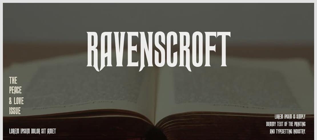
Ravenscroft Font is a display typeface with a strong, theatrical voice. The letters feel like classic haunted house signage, with quirky shapes and slightly exaggerated strokes. It leans into drama and mood, which gives it instant character on posters, banners, and title cards.
The exact creator of this font is designer unknown, which is quite common with themed display fonts that circulate online. Because of that, I pay extra attention to quality, consistency, and licensing details before taking it into any serious client work or wide production use.
The letterforms have tall, narrow proportions, with pointed terminals and uneven curves that add tension. Spacing is fairly tight, so large headlines feel compact and punchy. In smaller sizes, though, the busy shapes can start to blur, especially in dense copy. As a display font family, it works best for short words, titles, logos, and themed typography rather than long reading text.
Where Can You Use Ravenscroft Font?
I see Ravenscroft Font shining in projects that lean into mystery, magic, or horror. Think Halloween posters, escape room branding, theatre programmes, themed party invites, or spooky podcast covers. It builds a strong visual identity quickly, especially when used in big, bold headline sizes.
At large sizes, the quirky curves and sharp details read clearly and feel very intentional. On smaller labels, tickets, or body text, the same details become harder to read. I usually limit it to titles and then pair it with a clean sans-serif or serif font style for supporting copy, to keep the layout balanced.
For digital projects, it works well on hero images, YouTube thumbnails, and game splash screens where atmosphere matters more than strict neutrality. When I pair it, I pick simple typefaces with open counters and calm rhythm. That contrast helps Ravenscroft Font keep its spooky charm without overwhelming the whole design.
Font License
The licence for Ravenscroft Font can vary depending on where you download it. Some sources may allow personal use only, while others might permit commercial projects. I always recommend checking the current licence details at the original source before using it in client work or large-scale branding. My takeaway as Ayan Farabi: treat it as a mood piece, use it with care, and it will reward you in the right project.


Leave a Reply