
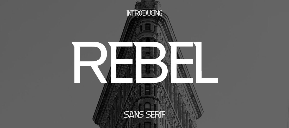

About Rebel Font
I came across Rebel Font while comparing a few bold options for a music event poster. I needed something clean, modern, and a bit tough, without going full grunge. Rebel Font stood out because it had that strong voice but still looked controlled and readable.
I decided to test it in a full layout, not just in a headline mock-up. I tried it in posters, a social banner set, and a simple landing page. That process helped me see where the typeface shines and where it needs more care. For designers reading Free Fonts Lab, here is how it really behaves in use.
Font Style & Design Analysis
Rebel Font is a sans-serif font family with a clear, modern attitude. The first thing I noticed was its solid, geometric base mixed with a few softer curves. It feels straight to the point, like it wants to be seen in loud, bold settings. The weight and shape make it look confident without becoming too aggressive.
From what I could confirm, the designer is unknown, which is common with many free fonts that circulate online. That lack of clear authorship means I judge it more by how it behaves in real layouts than by design story or branding. The construction still shows a careful eye, even if the background is not documented.
The letterforms are fairly wide, with open counters and simple shapes, which helps legibility at medium sizes. Spacing feels on the tight side in the heavier weights, so I often add a touch of tracking for headlines. The rhythm is steady, which works well for bold titles and short text blocks. As a sans-serif, it handles strong, direct messages better than long reading passages. It can struggle in very small body text, where the boldness and tight spacing start to feel cramped.
Where Can You Use Rebel Font?
Rebel Font works best in projects that need energy and clarity at the same time. I had good results using it in event posters, streetwear-style graphics, and social media promos. It suits brands that want a straightforward voice with a hint of edge, especially in music, gaming, or youth-focused projects.
At large sizes, Rebel Font stays sharp and clear, and the simple sans-serif shapes hold up well on both print and screens. For smaller text, like captions or UI labels, I would only use it in short bursts. Longer paragraphs start to feel pushy, so I pair it with a softer, more neutral typeface for body copy.
I like pairing Rebel Font with a calm humanist sans or a clean serif to balance its bold tone. It works nicely as the main display style in headlines, buttons, and callouts, while the supporting font handles detailed reading. If you keep enough white space around it and avoid very tight layouts, it gives a strong, controlled visual identity.
Font License
The licence for Rebel Font can change depending on where you download it, so I never assume full rights. Always check the official source for the latest terms, especially for commercial work. Make sure personal and client use is clearly allowed before you include it in a full brand system. My own rule is to double-check every time.
For me, Rebel Font is a handy option when I need a bold, modern sans with a direct voice, as long as I pair it wisely and respect its limits.


Leave a Reply