
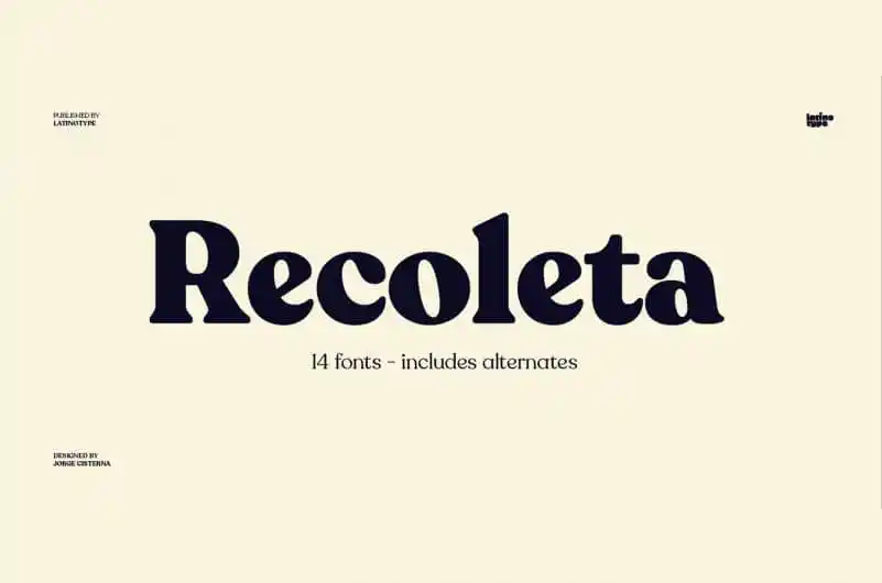

About Recoleta Font
My first reaction to Recoleta Font was simple: it felt warm and confident at the same time. The chunky curves and soft edges reminded me of classic magazine covers, but it still looked fresh enough for modern brands. That mix of old and new drew me in right away.
I decided to test it on a branding mock-up, a poster layout, and a simple social media set. I wanted to see if the font could handle both bold headlines and softer, friendly messages. Since I often review typefaces for Free Fonts Lab, I also paid close attention to how flexible it felt in real design work.
Font Style & Design Analysis
From a designer’s view, this is a strong serif typeface with a clear retro and vintage flavour. The heavy vertical strokes and round bowls give it a sturdy, grounded look, while the high contrast and angled terminals bring in a stylish twist. It feels made for headlines that need personality, not quiet body text.
The font is widely known as part of a professional font family used in many branding projects across the web. In most sources I checked, the designer details were not clearly stated, so I treat it as designer unknown when I discuss it with clients. That does not reduce its impact, but it does matter when I research its history and usage.
Looking closely at the letterforms, I noticed generous curves, tight counters, and a steady rhythm across the alphabet. The spacing feels fairly even in large sizes, though some pairs need manual kerning for logo work. At display scale, the mood feels bold, nostalgic, and friendly. At smaller sizes, the thick shapes can feel a bit heavy, so I avoid long paragraphs and stick to short lines or titles.
Where Can You Use Recoleta Font?
In real projects, I find this font shines in branding, posters, and editorial covers. It works best when the typography is the hero, such as on book jackets, magazine mastheads, or campaign headlines. For lifestyle brands, cafes, or wellness studios, the retro charm adds warmth without feeling silly or childish.
On screens, I like it for large hero headers on websites, bold slide titles, and social graphics with short, punchy text. At big sizes, every curve and serif detail reads clearly and adds visual identity. For smaller captions or long copy, I usually pair it with a clean sans-serif font family to keep everything readable and balanced.
When I design layouts, I often mix this serif with a light geometric sans to create contrast in weight and font style. The chunky, vintage shapes handle the main message, while the neutral partner covers body text and UI labels. For audiences who enjoy bold, expressive typography, this combo feels confident, stylish, and easy to scan on both print and digital pieces.
Font License
From what I could confirm, this font is not a simple free-for-all download. Personal and commercial rights can differ a lot between sources. I always recommend checking the official licence details carefully and making sure you have the correct permission before using it in client or paid projects. My own use stays within those terms.
After working with it across several layouts, my honest view as Ayan Farabi is that it is a strong choice when you need a bold, nostalgic serif voice. I reach for it when a project calls for warmth, impact, and a touch of vintage character, but I use it with care and good pairing to keep the design clear and readable.


Leave a Reply