
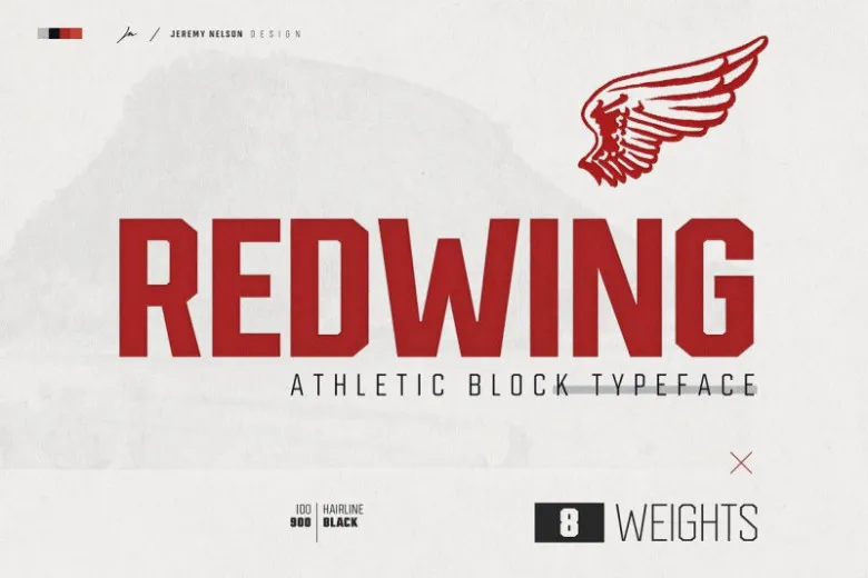

About Redwing Font
I first tried the Redwing Font while working on a bold sports poster that needed serious impact. The brief asked for something strong, loud, and easy to read from far away. My usual choices felt a bit too soft, so I went looking for a tougher voice.
What pulled me in was its heavy, squared look and very tight energy. It felt almost industrial, but still clean enough for modern branding. I tested it across a few layouts for Free Fonts Lab, just to see how flexible the font family could be beyond one loud headline.
Font Style & Design Analysis
Redwing Font is a pure display typeface, built for attention rather than long reading. The shapes are blocky and strong, with sharp edges and firm vertical stress. It has the kind of presence you expect on sports jerseys, racing posters, or bold product packaging, where impact matters more than subtlety.
From what I could confirm, the designer information is not clearly documented, so I will treat it as designer unknown. That said, the work shows a consistent design system. The font style feels planned, not random, with clear rules for corner cuts, stroke weight, and spacing. Nothing looks accidental.
The letterforms sit quite tight, which gives the typography a compressed, powerful rhythm. Straight sides, sturdy strokes, and minimal contrast create a dense visual texture. It shines in all caps, especially for short words and numbers. Longer text lines start to feel heavy and tiring, so I keep it for big titles. As a display font family, it delivers strength but not softness or nuance.
Where Can You Use Redwing Font?
I reach for Redwing Font when I need a loud, confident voice in a layout. It works best in large sizes on posters, banners, or hero images, where the chunky letterforms can breathe. Sports branding, gaming covers, and tough outdoor products are natural fits for this typeface.
At small sizes, the tight spacing and heavy strokes can blur together, especially on low-resolution screens or rough print surfaces. For body copy or detailed UI text, I always switch to a calmer sans-serif partner. A clean geometric or neo-grotesque font family pairs well, letting Redwing handle the headlines while the partner covers paragraphs.
For visual identity work, I would use it as a secondary display element, not the main logo in every case. It suits teams, events, and campaigns that want power, grit, or speed. When I combine it with generous letter-spacing, strong colour blocks, and simple grids, the typography feels controlled rather than shouting for no reason.
Font License
Licensing for Redwing Font can vary between sources, so I never assume it is free for all uses. Before using it in client work or commercial projects, I always check the official licence details carefully. Make sure you understand what is allowed for personal, print, and digital use.
My honest takeaway: I treat Redwing as a specialist tool for bold moments, not an everyday workhorse, and it rewards that respect.


Leave a Reply