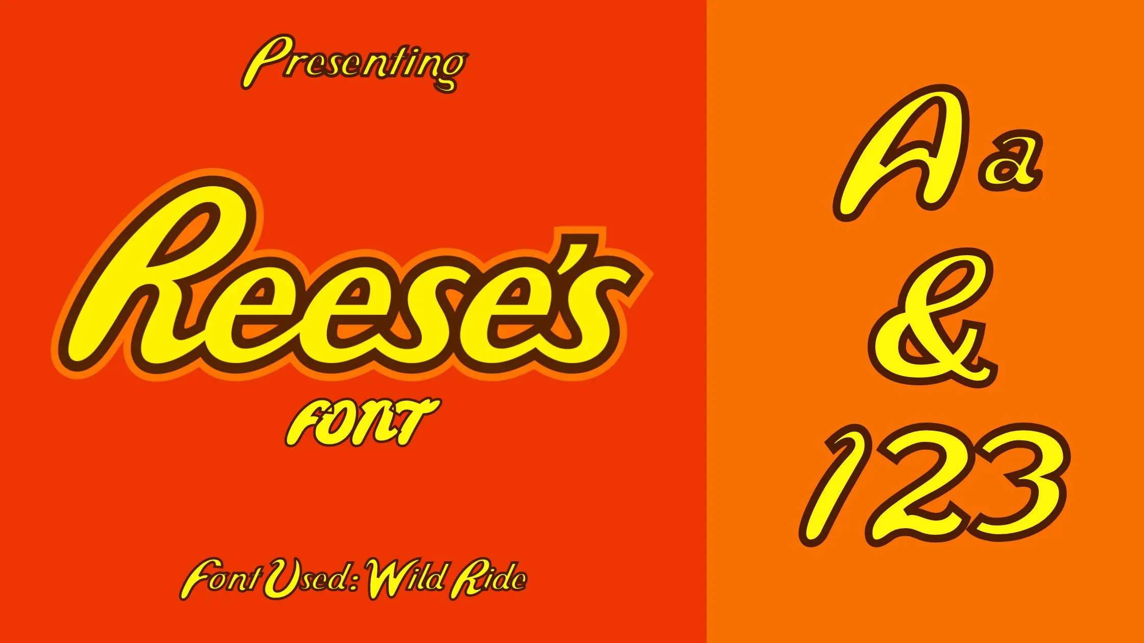
About Reeses Font
I bumped into Reeses Font while searching for a playful script for a sweet packaging mockup. I needed something friendly, flowing, and a bit nostalgic, but not too childish. This font caught my eye because the curves felt bold yet controlled, almost like carefully piped icing on a cake.
I tested it on a mock chocolate bar wrapper and a small social post series for Free Fonts Lab. The font handled big headline text well and kept its charm in simple logo-style lockups. I wanted to see if it could balance fun energy with clear readability, especially when used on bright, busy backgrounds.
Font Style & Design Analysis
Reeses Font is a script font, and its style leans toward bold, candy-like lettering. The strokes feel rounded and smooth, with strong curves and confident swooshes. It has that sign-painter flair, but the shapes stay quite clean. The general look feels warm, informal, and slightly retro, which suits playful brands and fun packaging.
The designer is listed as designer unknown, so I approached it with fresh eyes, without a strong branding story attached. That actually helped me judge the typeface just by its letterforms and behaviour in layouts. I checked consistency across the font family, tested different words, and tried a few languages with accents to see how stable everything felt.
The letterforms show thick, even strokes, with smooth connections between most letters. The spacing is on the tight side, which adds energy but can cause crowding in long words. The rhythm feels bouncy, with high contrast between tall letters and rounded bowls. It shines in short phrases and logos, but longer text blocks become tiring to read, especially at small sizes.
Where Can You Use Reeses Font?
I see Reeses Font working best in branding for sweets, snacks, cafés, and playful lifestyle products. It suits packaging, posters, and hero headlines where you want a joyful mood. At large sizes, the script style reads clearly and the curves feel expressive. The bold shape holds up well on bright, colourful designs.
At medium sizes, like sub-headings or short taglines, it still performs fine, but you need to watch line spacing and contrast. Dark text on a light background works better. For small body copy, this script font struggles, because the joined strokes and tight spacing reduce legibility. I used it only for key words and kept supporting text in a simple sans-serif.
Pairing-wise, clean geometric or humanist sans-serifs work nicely beside Reeses Font. They balance the busy script style and give your layout breathing room. Centre-aligned logo marks, circular badges, and curved text paths also play well with its flowing forms. I would avoid pairing it with other strong scripts, as the page can feel noisy very quickly.
Font License
The licensing for Reeses Font can change depending on the source, so I never assume usage rights. Before using it in any client or commercial project, I always check the official licence terms carefully and confirm whether personal, commercial, or web use is allowed.
For me, Reeses Font is a fun, bold script that works nicely when used with restraint. When I stay with short phrases, clear contrast, and a simple supporting font, it adds a sweet, friendly tone without overwhelming the design.


Leave a Reply