

About Reklame Script Font
I first tried Reklame Script Font while working on a small cafe rebrand that needed a friendly, retro wordmark. I wanted something with clear movement, but not too messy or wild. The name kept coming up in my research, so I downloaded it and started testing it in a few logo sketches.
What pulled me in was its balance between showy curves and everyday readability. It felt like classic shopfront lettering, but still modern enough for digital use. For my review here on Free Fonts Lab, I spent time setting headlines, mock packaging, and a few social graphics to see how far I could push it.
Font Style & Design Analysis
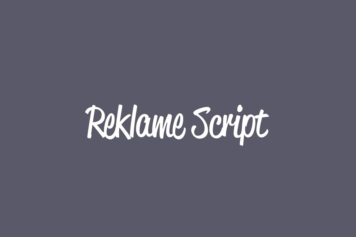
This is a pure script typeface with a strong sign-painting flavour. The strokes flow smoothly from letter to letter, with a confident, drawn-by-hand feel. It has the energy of vintage advertising, but the shapes stay clean and controlled. The font style leans bold and expressive, so it pulls attention very quickly in any layout.
The exact creator is not clearly credited, so I have to list the designer unknown. That said, the work shows a clear understanding of traditional brush lettering. The curves feel intentional, not random, and the joins follow a rhythm that suggests careful study of real sign work. It sits somewhere between casual script and classic display branding.
The letterforms have wide bodies, generous loops, and a steady slant that keeps the eye moving. Spacing is quite tight, which suits a connected script, but it can feel dense at smaller sizes. The rhythm works best in short words and phrases. It brings warmth and charm, though long passages become tiring. As a script font family, its strength lies in headlines, logos, and hero text rather than body copy.
Where Can You Use Reklame Script Font?
I found Reklame Script Font especially useful for branding that wants a friendly, crafted look. Cafes, bakeries, food trucks, barbers, and vintage-inspired shops can all benefit from its sign-like character. It sets a clear visual identity that feels both nostalgic and approachable, without sliding into parody or cartoon style.
At large sizes, the curves and swashes really shine, and the texture of the strokes reads clearly. On posters, packaging, menus, and hero banners, it stands out with strong presence. At smaller sizes, especially on mobile, the tight joins can blur, so I avoid using it for small captions or dense information. It is best treated as a display accent.
In layouts, I usually pair it with a simple sans-serif or a quiet serif for body text. A clean geometric sans helps the script headline feel even more expressive. I also keep colour palettes limited, so the typography stays the main focus. Used with restraint, this script typeface can add strong personality to logos, badges, and short taglines.
Font License
Before you use Reklame Script Font in client work or commercial projects, please check the official licence terms from the source where you download it. Some versions may allow personal use only, while others might need a paid or extended licence. I always confirm the licence details in writing to stay safe.
For me, this font works best when I need a bold, human script voice that still feels readable and controlled. When a project calls for warmth, movement, and a hint of vintage sign craft, this is one of the options I keep close on my shortlist.


Leave a Reply