

About Right Grotesk Font
I first reached for the Right Grotesk Font while building a clean landing page for a tech client. They wanted something modern, honest, and not too loud. My usual choices felt either too strict or too quirky, so I went looking for a new voice.
What caught my eye was its balance. It looked strong, but not cold. Simple, but not bland. I tested it across headings, body text, and UI labels to see how it behaved in real layouts. For Free Fonts Lab, I also wanted to understand how it might serve designers who need a flexible everyday workhorse.
Font Style & Design Analysis
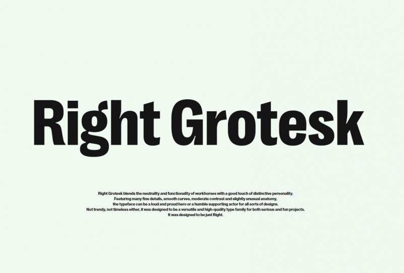
The Right Grotesk Font is a sans-serif typeface with a clear, geometric base. It has a modern look, but there is a soft, human touch in the curves. The forms feel rational and tidy, yet they avoid the harsh, mechanical feel some grotesk designs carry. On screen, it reads crisp and controlled.
The exact designer is unknown, but the font family feels carefully thought through. The weight range and structure suggest a focus on digital use first, with print as a close second. Nothing seems accidental. The spacing, contrast, and overall proportions point to someone who understands practical typography problems.
Looking closely, the letterforms show straight stems, open counters, and a steady rhythm from word to word. The spacing is on the safe side, which helps legibility at small sizes. In bold weights, it builds solid, confident headings. One limitation I noticed: in ultra-light styles, very small text can start to look a bit brittle. Used within its comfort zone, though, it offers a calm, neutral mood that supports many visual identities.
Where Can You Use Right Grotesk Font?
I found the Right Grotesk Font very dependable in product interfaces and dashboards. The sans-serif structure keeps labels, menus, and buttons tidy and fast to scan. At medium sizes, it feels clear but not shouty, which works well for apps aimed at both casual and professional users.
For branding, it suits tech, finance, education, and lifestyle projects that need a modern but approachable tone. It pairs nicely with a softer serif for long-form reading, or with a expressive display font for titles. In hero sections, heavier weights hold space well, especially with generous line spacing and simple layouts.
In print, I would use it for brochures, posters, and packaging where clean hierarchy matters. Large headings stay sharp, while short paragraphs remain readable. Very dense body text is not its sweet spot, but short copy, captions, and tables work fine. If you rely on strong typography in grids and systems, this sans-serif gives you a stable, predictable base.
Font License
The Right Grotesk Font may come with different licence terms depending on the source, especially for personal versus commercial use. I always recommend checking the official licence details before using it in client work, apps, or large campaigns. When in doubt, treat the licence with care and confirm permissions first. As Ayan Farabi, I see it as a steady tool worth testing in real layouts, especially if you value clean, honest typography.


Leave a Reply