
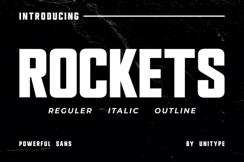

About Rockets Font
I came across Rockets Font while working on a small print poster that needed a serious, bookish tone but not a boring one. I wanted a serif that felt clear and calm, yet still had a bit of personality in its shape and rhythm. That search led me to test this typeface in a few different layouts.
What kept me interested was how steady and readable it looked at first sight. The letters felt familiar, almost like something from a classic novel, but with a slightly cleaner finish. I decided to try it in titles, pull quotes, and short body text and then share my thoughts later on Free Fonts Lab for other designers facing similar choices.
Font Style & Design Analysis
Rockets Font is a serif typeface, and it wears that category very clearly. The strokes have gentle contrast, with stable vertical lines and soft curves that feel controlled. It does not try to be loud or quirky. Instead, the font style stays balanced and calm, which helps it fit into more traditional layouts without drawing flashy attention.
The designer is unknown, at least from the sources I could access during testing. That said, the font family shows a level of care in spacing and general structure. It feels like someone paid attention to book typography and classic print, then simplified things slightly for digital use. Nothing in the set feels wild or experimental, but it does feel thoughtfully built.
The letterforms have modest serifs, not too thin, not too heavy, which helps with reading on screen and in print. The spacing feels even, especially in the lowercase, so text blocks form a steady grey tone. In headlines, Rockets Font gives a confident, almost literary mood. In longer paragraphs, it stays readable, though I would not use it for very tiny text. Its strength lies in calm, structured typography, while its limitation is that it will not suit highly expressive or playful visual identity systems.
Where Can You Use Rockets Font?
In my tests, Rockets Font worked best in editorial-style projects. Think book covers, chapter titles, essays, and long-form articles that need a serious but approachable feeling. It holds up nicely in medium sizes, like subheadings and pull quotes, where the serif details help guide the eye without feeling stiff or decorative.
At larger sizes, such as posters or hero headlines on a website, the serif structure gives the words a trustworthy, almost traditional tone. I paired it with a clean sans-serif for body copy, which created a clear hierarchy and modern balance. Used this way, the serif character supports authority, while the companion font provides contrast and ease for longer reading.
At smaller sizes, like captions or footnotes, you need to be a bit more careful. The serifs remain clear, but if the printing quality is not great, they may start to blur slightly. I would keep small text limited and test on real devices or paper before final print. For audiences in publishing, education, or formal branding, this serif typeface feels like a steady, safe choice.
Font License
The licence terms for Rockets Font can change depending on where you download it. I cannot promise specific rights for personal or commercial projects. Before you use it in paid client work or large distribution, always read the official licence text from the original source and confirm what is allowed.
My personal takeaway: I reach for Rockets Font when I need a calm, book-like serif that behaves predictably and supports the content instead of performing for attention.


Leave a Reply