
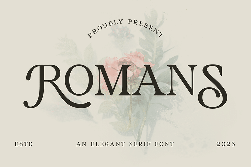

About Romans Font
I came across Romans Font while searching for a calm, classic serif for a simple book-style layout. I wanted something readable, not trendy, and with a quiet confidence. Many options felt either too decorative or too stiff, so I gave this one a closer look.
I tested it on a short editorial piece for Free Fonts Lab, mainly body text with a few pull quotes. The font handled that mix quite well. It felt steady, with a familiar bookish tone that did not fight the content. That first test made me curious to explore the typeface more deeply.
Font Style & Design Analysis
Romans Font is a serif typeface with a traditional, text-first design approach. The shapes lean towards a classic book style rather than a sharp modern look. The serifs are clear and defined, but not overly dramatic. The font style feels measured, slightly formal, and designed to support long reading.
The designer is unknown, but the decisions across the font family feel quite considered. The basic Latin set appears consistent, with a stable x-height and sensible proportions. It is not trying to reinvent typography or stand out on its own too loudly. Instead, it follows a more neutral, old-style text tradition.
The letterforms have moderate contrast between thick and thin strokes, which gives a gentle rhythm on the page. Spacing feels a bit tight in some pairs, but it still reads comfortably at normal sizes. The mood is serious and restrained, better for editorial or formal work than playful projects. Its main strength is steady readability; its main limitation is that it lacks strong personality for bold display work.
Where Can You Use Romans Font?
I find Romans Font most suitable for text-heavy projects where clarity matters more than style tricks. Think essays, short reports, simple brochures, or reading-focused websites. At medium sizes, the serif structure stays clean and clear, so it works well for main paragraphs and longer articles.
At large sizes, such as titles or pull quotes, the font still holds up, but the quiet nature becomes more obvious. It does not have the drama that many display serifs offer. For headers, I like pairing it with a clean sans-serif for contrast, letting this serif handle the body text while the sans-serif takes the spotlight.
At small sizes, like footnotes or captions, the moderate stroke contrast keeps letters from breaking down too much. Still, I would avoid very tiny text on low-resolution screens. For brands, Romans Font fits best with traditional, educational, or publishing-focused visual identities rather than bold lifestyle or tech brands.
Font License
The licence for Romans Font can vary depending on where you download it. Always check the current terms on the original source before using it in client work. Make sure the licence clearly allows your specific personal or commercial use, especially for logos, apps, or large print runs.
For me, Romans Font is a solid, dependable serif I reach for when I need calm, readable text that stays out of the way of the message.


Leave a Reply