
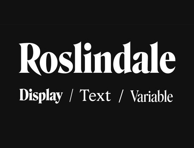

About Roslindale Display Font
I first reached for the Roslindale Display Font while working on a vintage-inspired magazine cover. I needed something dramatic, but also calm and readable. Many display fonts shout too loudly. This one had presence, but it did not feel cheap or forced.
As I tested it, I liked how the curves and sharp details worked together. The typeface gave the layout a bookish, classic tone without feeling dusty. That balance made me curious to explore it more deeply for Free Fonts Lab and see how it behaved across different settings.
Font Style & Design Analysis
Roslindale Display Font is a serif font, and it leans into that identity with confidence. It has high contrast strokes, crisp serifs, and a strong vertical pull. The style echoes old book and newspaper headlines, but there is a modern polish in the way the shapes are tightened and cleaned.
The font comes from David Jonathan Ross and his foundry DJR. His work often explores historical models with a fresh twist, and Roslindale follows that path. You can feel the influence of classic Victorian and early twentieth-century type, yet nothing here looks like a direct copy. It feels studied but personal.
The letterforms have compact proportions, tight spacing, and a clear rhythm that leans slightly serious. The sharp wedge serifs on the capitals give titles real bite, while the lowercase feels more relaxed. At large sizes, the contrast and details sing. At smaller text sizes, the thin parts can get fragile, so I keep it for headlines, pull quotes, and short display copy rather than long reading text.
Where Can You Use Roslindale Display Font?
I see Roslindale Display Font working best in editorial and identity projects that need a strong literary voice. Magazine covers, chapter openers, book jackets, and long-form article titles all benefit from its confident serif character. It instantly adds history and weight, which helps when you want readers to take the content seriously.
On posters and event graphics, it holds up very well at large sizes. The thin strokes and sharp details become part of the visual texture. For branding, I have used it for boutique shops, small publishers, and cultural events. It speaks to audiences who enjoy craft, heritage, and thoughtful design rather than loud, trendy looks.
For pairing, I often match Roslindale with a clean sans-serif for body text, something neutral and modern. This contrast lets the display shapes carry emotion while keeping reading smooth. I avoid using too many other decorative fonts alongside it. Letting this serif lead the hierarchy, supported by simple typography around it, usually gives the best result.
Font License
The licence for Roslindale Display Font can vary based on where and how you get it. Some versions may allow personal use only, while others may cover commercial projects. I always advise checking the official source for the latest licence terms before using it in any client or paid work, just to stay safe.
My personal takeaway: Roslindale rewards careful, intentional use. When I give it space, respect its display nature, and pair it with simpler companions, it delivers a rich, confident voice that feels both historic and current.


Leave a Reply