
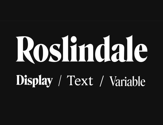

About Roslindale Font
I ran into the Roslindale Font while working on a book cover that needed a classic, bookish feel without looking dusty. I wanted a serif that felt rooted in tradition, but still sharp enough for modern layouts. Roslindale caught my eye because it balances elegance with a slightly rugged edge.
What pulled me in was its strong personality. The curves felt warm, yet the structure stayed firm and confident. I tested it in titles, pull quotes, and small captions to see how flexible it really was. For my review on Free Fonts Lab, I pushed it through several print and digital mockups before forming an opinion.
Font Style & Design Analysis
Roslindale Font is a serif typeface with a strong editorial voice. It clearly nods to old-style book typography, but the shapes feel tightened and refreshed. The contrast between thick and thin strokes is noticeable, yet not so extreme that it becomes hard to read. It feels made for pages that tell serious stories.
The font family comes from David Jonathan Ross and his foundry DJR, known for thoughtful, characterful type design. That background shows here. Roslindale feels carefully tuned, not just drawn. You can sense a clear design idea: honour classic text faces while pushing them to work harder in contemporary layouts.
Looking closely at the letterforms, I see crisp serifs, compact proportions, and a firm vertical rhythm. The spacing feels slightly tight by default, which works beautifully for headlines and large type. In long paragraphs, a small increase in tracking helps. The mood is literary, serious, and confident. It shines in strong titles, but it is less ideal for ultra-small body text on low-resolution screens.
Where Can You Use Roslindale Font?
I see Roslindale Font working best in editorial settings: book covers, magazine spreads, long-form articles, and cultural posters. In large sizes, the serif details really stand out and add texture. It carries a sense of history that suits museums, theatre work, and thoughtful brand stories.
At medium sizes, like subheadings, pull quotes, and navigation labels, the typeface stays sharp and readable. On high-resolution screens, it performs well as short body copy too, if you give it enough line spacing. For print, especially on good paper, it feels almost tailor-made. The strokes render rich, and the contrast adds energy without shouting.
When pairing, I like it with a clean sans-serif for body text or UI elements. Something neutral and open helps balance Roslindale’s strong voice. I would avoid pairing it with another dramatic serif, as they will likely compete. Used as the main display face in a serif-driven visual identity, it can define the tone of a brand that values depth, culture, and craft.
Font License
Licensing for Roslindale Font can vary depending on the source and package you choose. Always check the official foundry or distributor for clear terms, especially for commercial work. Do not assume that personal use rules apply to client projects. I always review the licence carefully before including it in paid design systems.
My honest takeaway: when I need a serif with weight, history, and a clear voice, Roslindale stays on my shortlist.


Leave a Reply