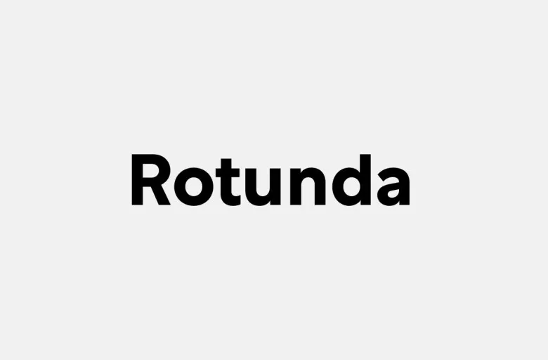
About Rotunda Font
I came to Rotunda Font while testing options for a calm, modern logo system for a wellness brand. I needed a voice that felt friendly, but not childish, and clean without feeling cold. The rounded shapes of this typeface caught my eye right away and made me curious.
I decided to try it in a few layouts for that project and a simple poster study for Free Fonts Lab. I wanted to see how it behaved in both logos and short text. The mix of soft curves and steady structure made me keep exploring the font in more detail.
Font Style & Design Analysis
Rotunda Font is a sans-serif typeface with a gentle, rounded character. The overall design aims for clarity, but it softens the usual sharp feel of many geometric fonts. Strokes look even, terminals feel smooth, and the shapes lean more towards circles than strict squares, which gives the font a relaxed tone.
The designer is unknown, at least from the sources I could check with confidence. That said, the font family shows a careful hand. The weights feel planned, not random, and there is a clear sense of system in the way each style relates to the others. Nothing feels rushed or accidental.
The letterforms use generous curves, especially in characters like “a”, “e”, and “s”. Spacing feels open enough for small text, but not so wide that headlines fall apart. The rhythm is even and easy on the eye, which helps in longer phrases. Its strength lies in soft, modern branding and calm interfaces; highly condensed layouts or very tight tracking are not its best use.
Where Can You Use Rotunda Font?
In my tests, Rotunda Font worked well in brand systems for wellness, tech for everyday users, and friendly corporate decks. The sans-serif structure keeps it professional, while the rounded shapes bring warmth and approachability. It speaks well to audiences that need clarity without tension, like education or lifestyle products.
At larger sizes, the font style feels smooth and confident in headlines, hero text, and logotypes. The round terminals stand out nicely on posters and social graphics. In smaller sizes, such as app UI labels or captions, the open forms stay readable, though I avoid very light weights on low-resolution screens.
I like pairing this typeface with a sharp serif for contrast, especially in editorial-style layouts. Used as the main sans-serif, it holds navigation, buttons, and short paragraphs comfortably. It can also serve as a single-font solution for simple brand systems, as long as the visual identity leans towards calm, modern, and human rather than edgy or aggressive.
Font License
The licence terms for Rotunda Font can differ depending on the source where you obtain it. Always check the official licence before using it in client work, apps, logos, or commercial projects. I recommend reading the usage rights carefully so personal experiments and professional jobs stay safe and compliant.
For me, Rotunda Font has become a quiet option I reach for when a project needs soft clarity and a human touch without drama.


Leave a Reply