

About Royals Font
I first tried Royals Font while working on a bold sports poster for a school event. I needed a strong headline that felt proud, loud, and easy to read from far away. The name caught my eye, but the shapes of the letters kept me there.
As I tested it on different mockups, I saw how quickly it set a clear mood. It has that big-arena, team-spirit energy without looking cheap or messy. I decided to review it for Free Fonts Lab because I wanted to see how far I could push it in real layouts, not just in a single poster.
Font Style & Design Analysis
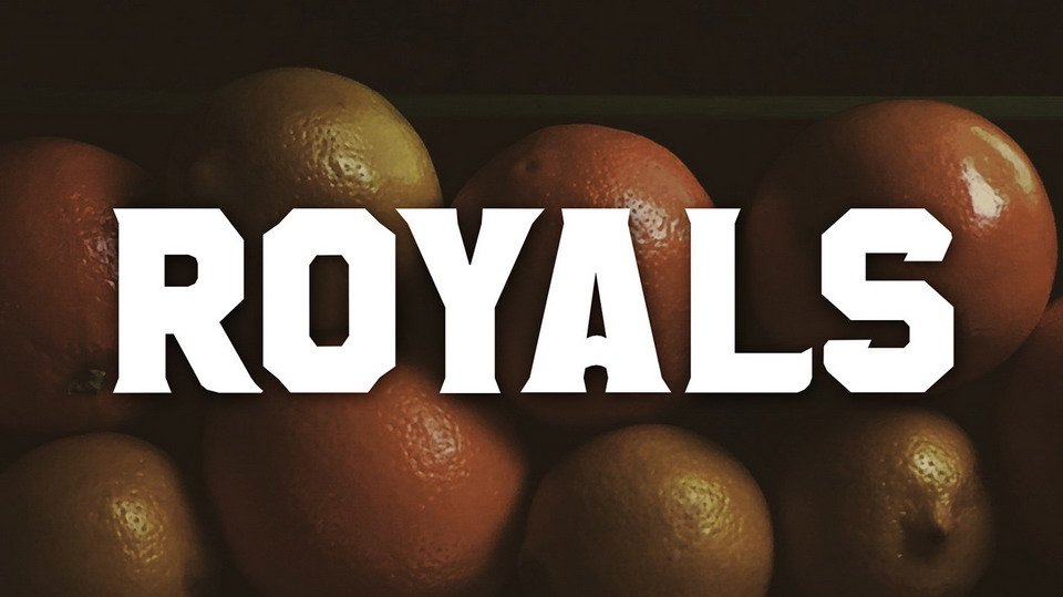
Royals Font is a bold display typeface, and you feel that right away. The font style is made for attention, not for long blocks of reading. The letters are wide, sharp, and a bit dramatic, almost like classic varsity or league titles, but with a more polished, modern touch.
The designer is listed as designer unknown, which is a bit of a shame, because there is clear intention behind this font family. The structure of the letterforms shows someone who understands sports branding, poster work, and strong visual identity. It feels crafted for banners, covers, and loud statements rather than subtle design.
The letterforms have thick strokes, tight inner spaces, and slightly compact shapes. This gives the text a heavy, grounded rhythm. Spacing is on the tighter side, so in all caps you may want to add a little tracking. It works well for short words and numbers, but loses clarity in long sentences. As a display font, its strength is impact, not flexibility.
Where Can You Use Royals Font?
I see Royals Font working best in sports graphics, game-day posters, and school or college branding. It suits team logos, tournament titles, and jersey numbers when used with care. At large sizes on print or screen, the strong shapes really shine and hold the viewer’s eye.
On smaller text, especially below medium headline size, the tight details start to blur. I would not set body copy or long taglines in this typeface. Instead, I pair it with a clean sans-serif for small text. A simple, neutral typeface beside it helps the heavy style breathe and keeps the layout balanced.
For audiences, it speaks well to younger crowds, sports fans, gaming teams, and bold streetwear projects. It can also work in event branding, like concerts or festivals, where you want clear, loud typography. I would avoid using it in formal or delicate designs, because the energy is too strong and might overpower the rest of the visual identity.
Font License
The licence for Royals Font can change depending on where you download it. Some sources may allow personal use only, while commercial projects might need a paid or special licence. I always recommend checking the latest licence details from the original source before using it in client work or large campaigns.
For me, Royals Font is a useful tool when I need loud, confident typography, but I reach for it only when the project truly calls for that kind of power.


Leave a Reply