
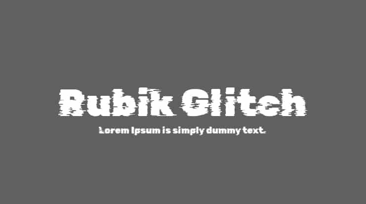

About Rubik Glitch Font
I came to the Rubik Glitch Font while searching for a bold headline style for a digital poster. I wanted something that felt modern, slightly broken, and a bit unstable, but still readable. The name caught my eye first, then the sharp, digital feel kept my attention.
I decided to test it on a few concept layouts for a gaming event and a music stream graphic for Free Fonts Lab. In both cases, I needed strong visual noise without losing the message. This font seemed like a good way to push that tension between control and chaos.
Font Style & Design Analysis
This is a sans-serif typeface at its base, but with a deliberate glitch treatment on each character. The core structure feels geometric and clean, then sliced and shifted as if a screen froze mid-frame. That contrast between simple skeleton and broken surface gives it a very digital, tech-heavy personality.
The designer is unknown, but the idea clearly follows the wider glitch typography trend. It fits well beside other contemporary experimental fonts, but still keeps a link to the original Rubik family. You can feel that the basic grid and proportions are not random; the distortions sit on top of a stable system.
The letterforms keep wide shapes and firm strokes, which helps the eye stay on track through the visual noise. Spacing sits on the tighter side, which works nicely for big, compact headlines but can feel crowded in long words. The rhythm feels choppy by design, so this font family shines in short titles, logos, and labels, and struggles in paragraphs or detailed interface text.
Where Can You Use Rubik Glitch Font?
In my tests, the Rubik Glitch Font worked best on large display sizes where the glitch details can breathe. Event posters, Twitch or YouTube thumbnails, e-sports branding, and cyberpunk-style covers all felt like natural homes for this font style. It instantly signals tech, error, or digital tension.
At medium size, like social posts or UI banners, it still holds up if you keep words short and high contrast. I would avoid using it for navigation menus, long captions, or anything that needs quick scanning. For those parts, pairing it with a calm, neutral sans-serif body typeface gives a clear visual hierarchy and keeps the design usable.
For brand work, I would keep this typeface as a supporting accent in the visual identity, not the main voice. It adds flavour to logos for music producers, gaming teams, tech festivals, and glitch art projects. Used in small bursts, it creates a strong mood without overwhelming the rest of the typography system.
Font License
The Rubik Glitch Font may have different licence terms depending on the source you use. Before using it in client work, products, or commercial branding, always check the official licence information. I recommend confirming both personal and commercial permissions so there are no surprises later.
For me, this font is a sharp tool for very specific jobs: when I need digital chaos that still respects the grid.


Leave a Reply