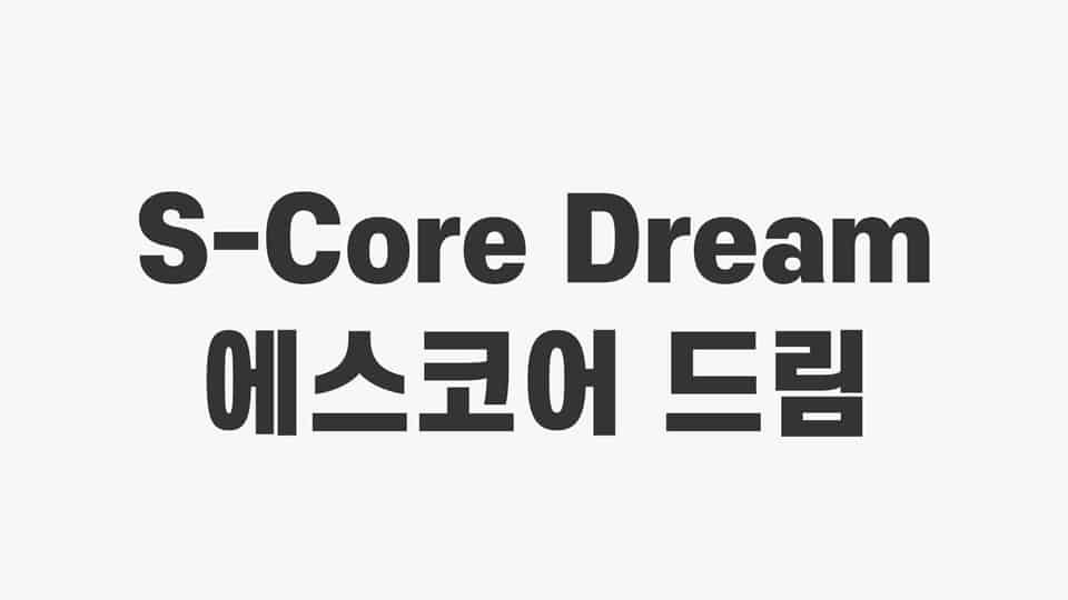
About S-core Dream
I first picked up S-core Dream while working on a clean interface for a small web app. I needed a neutral sans-serif that felt modern, but not cold or harsh. Many options looked either too corporate or too playful, so I started testing lesser-known font families.
What kept me looking at this typeface was its calm, open texture. It has a quiet confidence that works well for everyday design. I tried it in headings, body text, and simple UI labels. For a review on Free Fonts Lab, I spent extra time seeing how far I could push it in real layouts.
Font Style & Design Analysis
S-core Dream is a sans-serif typeface with a clean and rational design. The shapes are mostly geometric, but there is enough softness in the curves to avoid a cold, technical feeling. The overall colour on the page feels even and relaxed, which makes it friendly for long screen reading.
The exact designer is designer unknown, at least from what I could find through normal research. That lack of background does not hurt the font itself, but it does mean I rely more on direct testing than on any brand story. In this case, the design choices speak clearly enough on their own.
The letterforms are open, with generous counters and simple terminals, which helps legibility at small sizes. Spacing feels slightly on the loose side, giving text a breathable rhythm. In heavier weights, the mood becomes more assertive without turning shouty. The main strength lies in UI and body copy; the limitation is that it may feel a bit too plain for highly expressive branding. Still, as a solid sans-serif workhorse, S-core Dream holds up well.
Where Can You Use S-core Dream?
In my tests, S-core Dream behaved very well in digital interfaces. Buttons, menus, and form labels stayed clear and readable, even on smaller phone screens. At small sizes, the open shapes and balanced spacing keep the letters from clumping together, which is essential for smooth user experience work.
For headings and display use, medium and semi-bold weights give enough presence for dashboards, blogs, and product pages. On posters or large banners, it looks tidy but low-key, so it suits calm, practical brands more than loud, edgy ones. When I wanted extra character, I paired this sans-serif with a warm serif for contrast.
I would reach for this font family in tech startups, education platforms, and straightforward corporate sites. It also works nicely in simple presentations, documentation, and internal systems where clarity matters most. Because S-core Dream is a neutral sans-serif, it blends well with icons and flat design elements, without fighting for attention.
Font License
The licence for S-core Dream can change depending on the source, so I never assume rights. Always read the official licence terms carefully before using it in personal or commercial projects. When in doubt, confirm permissions or look for a clearly stated usage policy.
For me, S-core Dream is a quiet, dependable option I keep in mind when a project needs clarity first and personality second.


Leave a Reply