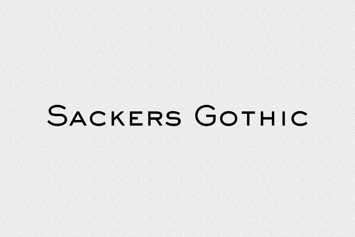
About Sackers Gothic Font
My first reaction to Sackers Gothic Font was simple: calm, clean, and a bit timeless. I reached for it while working on a small brand refresh that needed quiet strength, not loud drama. The font felt like a steady voice in a busy room, which made me curious.
During early tests, I tried it on logos, headings, and a basic stationery set. Each time, the typeface stayed clear and steady, even with tight grids and simple layouts. That balance of restraint and character made me want to explore it more for Free Fonts Lab and see where it truly shines.
Font Style & Design Analysis
From a design view, this is a minimal sans-serif with a classic, almost engraved feel. The shapes look influenced by traditional lettering found on plaques and formal signs. It leans towards a refined, elegant direction, rather than a loud display font. The result is a calm, confident font style that feels reliable.
As far as I can confirm, the exact designer is unclear, so I will note the designer unknown. Many versions appear across different foundries and libraries, which adds a bit of history and variation. That scattered background fits the way the font feels: traditional, but floating between ages and uses.
Looking closely at the letterforms, the strokes are even, straight, and quite narrow. Counters stay open, but the spacing runs tight, so words form compact blocks. This gives a steady rhythm on the page, but it can look cramped if you set long text. It works best for titles, names, and short phrases where clarity and formality matter most.
Where Can You Use Sackers Gothic Font?
In real projects, I found it very useful for visual identity work. Brand marks, wordmarks, and logotypes for law firms, consultants, or heritage brands all gain a quiet authority from it. On business cards and letterheads, it gives a tidy, professional face without shouting for attention.
On large sizes, such as posters, signage, or packaging, the sans-serif details hold up well. Sharp edges and simple geometry stay clean even when scaled big. On the other hand, at very small sizes, especially in dense paragraphs, the narrow spacing can hurt readability. I use it for labels and small notes only when text is short and tracking is slightly opened.
Pairing it with another font family helps bring out its strengths. I like combining it with a soft serif for long body text, which adds warmth next to its cool tone. In layouts, it works nicely for section headings, pull quotes, and navigation, guiding the reader without fighting the main content.
Font License
Licensing for Sackers Gothic Font varies between sources, so it is important to check carefully. Some releases may allow personal use, while commercial projects often need a paid licence. Before using it in client work or branding, I always confirm terms on the official source to avoid problems later.
My personal takeaway as Ayan Farabi: I see Sackers Gothic Font as a quiet specialist, not a general workhorse. When a project needs discreet elegance and a formal voice, it does the job with grace, as long as I respect its limits in small text and give it space to breathe.


Leave a Reply