

About Saiyan Font
I ran into Saiyan Font while I was hunting for a bold, cartoon-style title for a fan poster. I needed something loud, playful, and a bit wild, but not messy or hard to read. The name caught my eye first, but the shapes made me stop and really look.
Back at the studio, I tested the font in a few mock-ups for Free Fonts Lab. I tried game covers, YouTube thumbnails, and a fake anime event banner. I wanted to see if the style could handle real layouts, not just look cool in a logo preview.
Font Style & Design Analysis
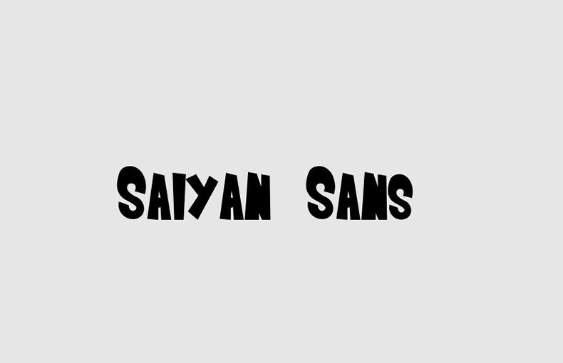
Saiyan Font is a pure display typeface, and it acts exactly like one. The letters feel big, heavy, and built for impact. The overall font style leans towards comic and anime energy, with thick strokes and sharp edges that push the eye towards the centre of the word.
The designer is unknown, which is a shame, because there is a clear sense of intent in this font family. Each character looks like it was drawn with a bold marker and then cleaned up for digital use. Nothing feels random, even though the design has a playful, exaggerated tone.
The letterforms have chunky bodies, tight counters, and a slight forward motion that gives a sense of speed. Spacing is fairly tight, which works well for big titles but can feel crowded in long words. The rhythm feels punchy, not elegant, and that suits its mood. As a display face, it shines in short bursts, but it is not made for paragraphs or small captions.
Where Can You Use Saiyan Font?
I see Saiyan Font working best in projects that need loud, high-energy typography. Think gaming posters, anime events, fan art covers, toy packaging, or kids’ book titles. It speaks to young audiences, pop culture fans, and anyone who enjoys action-heavy visual identity work.
At large sizes, the font holds its shape very well. The curves and angles stay clean, and the heavy strokes create strong contrast against flat backgrounds. At smaller sizes, though, the tight spacing and thick forms start to blend, so I avoid using it below logo or heading size.
For pairing, I usually set Saiyan Font as the hero and then match it with a simple sans-serif for body text. A clean, neutral typeface helps balance the noise and keeps layouts readable. I also find it works best with flat colours, bold gradients, and simple compositions, rather than detailed photos or complex textures.
Font License
The licence for Saiyan Font can vary depending on where you download it. Some sources may allow personal use only, while others might permit commercial projects. I always suggest reading the full licence terms on the original source and making sure they cover your client or commercial needs before you use it.
For me, Saiyan Font is a fun, focused tool: perfect when I need strong anime-style energy, but only in short, bold doses.


Leave a Reply