
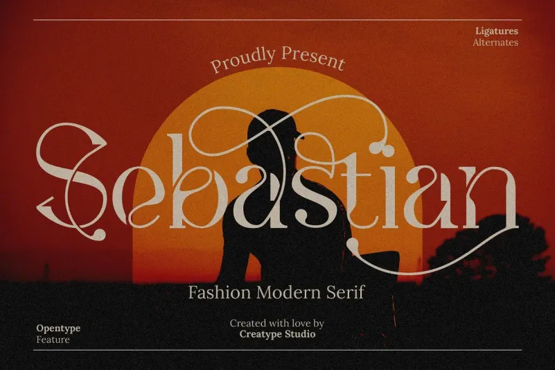

About Sebastian Font
I first tried Sebastian Font while working on a small print booklet for a quiet lifestyle brand. I needed a serif that felt calm, but not boring. Something readable on paper, yet still a bit refined. Sebastian caught my eye because its shapes looked gentle, with a soft rhythm that felt easy on the eyes.
I tested it in headings, pull quotes, and longer body text. It handled all three better than I expected. The letterforms stayed clear even at smaller sizes, which made layout work smoother and faster. I later wrote notes about it for Free Fonts Lab because it felt like a typeface worth a closer look.
Font Style & Design Analysis
Sebastian Font is a classic serif typeface with a friendly, bookish tone. The overall design leans towards traditional print typography but with a softer edge. The serifs are firm but not harsh, which gives a stable look on the page. It feels made for reading, not just for show, and that comes through in every line.
The designer is unknown, at least from what I could safely confirm during my tests. Without clear credit from a trusted source, I prefer not to guess. What I can say is that the font family feels carefully built, with consistent weights and a clean structure that suggests a patient design process behind it.
The letterforms have moderate contrast between thick and thin strokes, which keeps text lively without causing strain. Counters stay open, so letters like “a”, “e”, and “s” remain readable at smaller sizes. Spacing feels balanced by default, with a steady rhythm that suits long paragraphs. In my layouts, it worked well for body copy and mid-sized subheadings. Its main limitation appears when used in very bold, loud, poster-style settings, where it can look a bit too polite.
Where Can You Use Sebastian Font?
I see Sebastian Font working best in editorial and long-form reading. It suits books, magazines, essays, and calm brand stories. At medium sizes, such as chapter titles and section headers, the serif details come through nicely. On print paper, it feels warm and stable, giving text a confident, steady voice without shouting.
On screens, the serif structure still holds up, though I preferred using it above 12–14 points for comfort. It can serve as the main text font on blogs, case studies, and portfolio write-ups, especially if you aim for a mature and thoughtful visual identity. For pairing, I liked using a simple sans-serif for navigation and captions, letting Sebastian carry the main narrative.
For branding, it fits well with calm lifestyle labels, craft products, studios, and educational projects. When I tested it in a logo lockup, the font style worked best for wordmarks that need trust and clarity rather than high-energy impact. Used with enough white space and modest colour palettes, this serif brings a quiet, reliable feel that many clients appreciate.
Font License
Before using Sebastian Font in client or commercial work, always check the current licence from the official source. Terms can change, and personal use rules may differ from commercial rights. I treat every download with caution and confirm permissions each time, especially for logos or large print runs.
My simple takeaway as Ayan Farabi: Sebastian is a steady serif I trust for readable, calm layouts when I want the type to support the message, not dominate it.


Leave a Reply